Calls-to-action – shortened to CTAs – come in a variety of forms. They can be shouty and loud, like colourful buttons or image-led banners, or more subtle, like text links. But they always prompt people to 'do' something – and do it now!
In terms of your website, you probably want people to click a link – to join your mailing list, make a donation, or buy tickets to a show, for example. With all kinds of different actions, messages, formats, and audiences, however, there isn't a nice, neat recipe for creating the perfect call to action every time.
We've put together the following questions, considerations, principles, and practical tips to point you in the right direction – helping you to make CTAs that engage audiences, and achieve your business goals.
What are you saying?
🔎 Identify your goals
Before getting into the detail, you need to know what it is you want people to do. What are your goals?
These could be commercial goals like buying a ticket or making a donation, other measurable goals including things like mailing list sign up, or softer goals – brand-level engagement to make audiences feel closer to your organisation, work, and artists.
It's important to remember that every page of your website should serve a purpose. Don't leave people at a dead-end; lead them towards one of your goals.
🎾 The single-minded proposition
Your website will have a number of goals. But remember to concentrate on one goal – one call to action – at a time. As it's Wimbledon fortnight here's a topical tennis ball analogy, often cited in advertising and marketing:
If 10 tennis balls are thrown to you at once, you might manage to catch one, but miss all the others. If those 10 tennis balls are thrown one after another – allowing you to focus on one at a time – you'll probably catch most, if not all, of them.
Who are you saying it to?
🤗 Know your audience
Understanding your audience, and their intentions at each click, is important. So, give some thought here to the user journey, and how many stages someone might need to go through before reaching that end goal.
If someone's read a News story about your latest season all the way to the end, they may be ready to 'Sign-up to the Mailing List' right away. But perhaps they'd want to 'Find out more' – shows, dates, times, access provisions, ticket prices – before feeling ready to 'Buy tickets' there-and-then?
👉 You might find our handy download useful: A Beginner's Guide to User Experience [171KB PDF]. It covers the basics of identifying users and their goals, putting yourself in their shoes, and reviewing user journeys – and also includes helpful worksheets!
How are you saying it?
👍 Plain language and simple messaging
Despite people still skim-reading web copy, the words you choose for your CTAs are important.
Use a verb so the intended action is clear. And, as people can't easily skim-read lots of words, keep CTAs short. Simple, unambiguous language that tells people what to do, and suggests what they can expect once they do it.
For example – I expect "Buy tickets" will take me into a ticketing purchase path. Clicking "Sign up for regular updates" will take me to a mailing list form. "Find out more" will give me added detail about this thing I'm interested in – either by taking me to a new page or expanding the current one.
Button text is especially important as it's the final part of your CTA before, hopefully, a click. The most effective and engaging button text finishes the sentences, either “Would you like to [button text]?” or “I would like to [button text]”. This is sometimes referred to as WYLTIWLT – pronounced ‘wilty wilt’. Cute. Read more about this in the UX Booth article, The Grammar of Interactivity.
Conveying information in a way that makes sense to the audience and using the language they use, while making it clear what they'll get from the interaction, is really effective.
🎨 Design
Make sure CTAs are distinguishable from the rest of your content. Something as simple as a text link being bold or underlined instantly suggests to people that they can click/select it.
It's useful to have a range of CTA designs at your disposal. Perhaps a distinctive banner / highlight box? Some might include a graphic or an image? In some circumstances, a smidge of interaction design could help your CTA to stand out – but be careful not to overdo it!
👉 We shared this handy intro to interaction design earlier in the year.
Good design will help the user notice your CTA, understand it, and take an action – even if they don't read every carefully-crafted word.
One last point about design: remember to give your CTAs space. Thinking back to that tennis ball analogy – giving space to your CTA will help users focus on 'catching' that one message, and taking that particular action.
When and where are you saying it?
📍 Placement and context matter
Your CTAs don't live in isolation. When – in the user journey – and where – on the page – you choose to place them will have an impact on their effectiveness.
To decide when to place a CTA within the user journey, it's
useful to consider the context: How did people get here? What else is on this page? Will someone
be ready to 'buy', 'sign up', or 'donate' at this point or do they need more information first? Are there other CTAs on this page, fighting for your users' attention?
🤓 The science bit
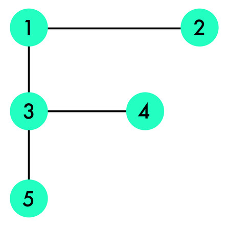
Usability studies have shown that if a user is only semi-interested in a page’s content, they will scan the top of the page in two horizontal movements, then skim down the left-hand side of the page. This is known as the F pattern.

Blog and news sites often take advantage of the F pattern by placing a ‘Sign up’ CTA or advert in the top-right portion of the page. Top-right is also where you might find ‘Buy ticket’ buttons on a theatre's event pages, for example. That's because, for those people who're ready to buy tickets, it’s useful for them to be able to do so right away.
A more engaged reader who's looking for more information might follow a Z pattern (or a zig-zag of repeated Zs), and take-in more of the page's content. (The Z pattern is based on the Western habit of reading left to right.)

The final 'terminal area' – depicted in the Z pattern diagram at point 4 – is where people stop reading. A good point to add your CTA.
It may also be that you add CTAs within the flow of the page. Then, for those people ready to "Buy" or "Sign up" before reaching the end of the page, they can do. (But make sure to include a CTA at the end too – some people may take more convincing!)
Let's think about this Z pattern in terms of a News item.
Someone’s landed on
your website following a social media link. They wanted to read more about your
latest community project. They clicked, so they’re clearly interested and engaged. This is a great opportunity to add a ‘Donate’ call to action – when they're engaged, and have clear context about what their donation will support right in front of them.
In our experience these
contextual calls to action are far more effective than, for example,
having a ‘Donate’ link in the header of every page of the website. (People tend to stop noticing things when they're always the same.)
There's a lot to think about!
So, a general rule of thumb when deciding the best place for a CTA? Always consider context; from the user's point of view.
How well are your CTAs working?
🧪 Track and experiment
How many click-throughs – ticket sales, donations, sign ups – are your CTAs getting? If you don't know, try to find out. Tracking this doesn't necessarily mean adding more code that slows down your website, which is detrimental to user experience. You can find a lot of data in your website analytics.
Perhaps try some basic experimentation – changing the language you use, the type of image, or where a CTA is placed on a page. Which has the greatest level of response – asking people to "Donate now" or "Support our artists"? Showing an image of a beautiful auditorium or people taking part in a community theatre class? A mailing list sign up link top right of a News page, or at the end of a News item?
🧡 Review
It's important throughout all of the above, to be mindful your organisation's brand – your tone of voice, personality, visual identity etc. To ensure this, it can be helpful to gather together all of the CTAs on your website (and perhaps other places too), and review them all at once.
The messaging and design will be different, sometimes even the tone depending on what you're saying and to whom – but they should read in the same 'voice'. They need to sound like you. This brand consistency demonstrates authenticity, which in turn helps to build trust and closeness with your audience.
👉 You might like our 2-part article about adding Personality, Purpose + Heart to your website.
Examples

Clear, bold statements fit with Sheffield Theatres' confident brand voice. Use of the word 'your' speaks directly to the audience. And the word 'Shows' – as opposed to 'Events' or 'Productions' – reflects the language used by audiences.

We know that placing ticket links top right on event pages – as well as at the foot of the page – can help with conversions. If it works for your brand, perhaps adding a little animation could help add personality as well as attracting attention to encourage clicks?

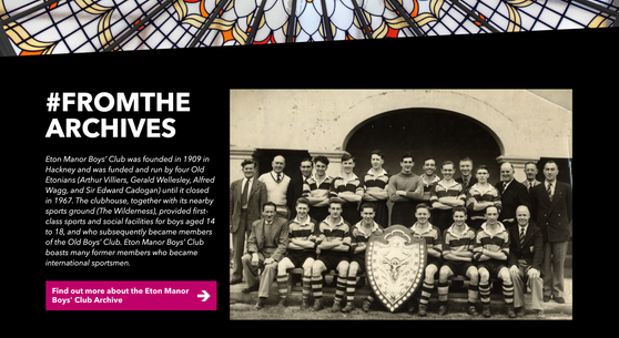
"Never leave users at a dead-end". Maybe include a call-to-action in your footer? Remember goals don't have to be commercially focused. Content that surprises can give people a feel for your organisation, and create a moment of delight e.g. Bishopsgate Institute's footer includes a frequently changing Archive image, caption – and link to more!
In summary:
- Identify the goal of your call to action – focusing on one goal per CTA
- Consider who you're talking to – and explain benefits to them
- Make the action you want them to take clear – using their language
- Design CTAs differently from other content – and give them plenty of breathing space
- Placement matters – use CTAs in appropriate contexts within your user's journey
- Track and experiment – find out what works well (and what doesn't)
- Review – to ensure a consistent tone of voice across your website and other comms
🛎️ Join the Supercool Mailing List for more like this
Plus: sector news, tech innovations, and invitations to our FREE events – covering digital hot topics in the arts and culture sector

