Hi! I’m a new front end developer at Supercool. It’s been great getting to know everyone here, and getting to grips with all the systems, tools, and processes. I've been exploring Spektrix – the ticketing system many of our clients use – and figuring out how to integrate Spektrix iframes into the custom sites we build for our clients.
The Spektrix iframes are the same across all Spektrix users, but they need to be styled to fit in with each organisation's individual brand. There are also times when Spektrix release new features or tweaks which result in changes to, or whole new, iframes. The challenge for us is managing these across multiple sites, and having an efficient way to make global changes and update styling. I started looking at branding with colour and how we can easily generate style sheets.
So a cute thing I wrote is a super-simple little sassy colour palette to generate a theme for Spektrix iframes – from a brand colour.
Let’s bop through these. You’d only set these two variables, $background and $brand-color, everything else is rigged to ripple from those.
Base
Code Sample
$background: white;
$foreground: invert($background);
So you can always get black text for white background or the inverse.
Brand
Code Sample
$brand-color:#ff5500;
$brand-color-active: (darken($brand-color, 12%) + 12) ;
Let’s put in Supercool’s orange: #f50 and then let’s take the brand colour down a little to give a selected, active or “pressed down” state, but we’ll add 12 to make sure this number never reaches zero, or black, so you can brand from black or very dark colours. We’ll only add a little as we don’t want to move too far around the wheel.
Accents
Code Sample
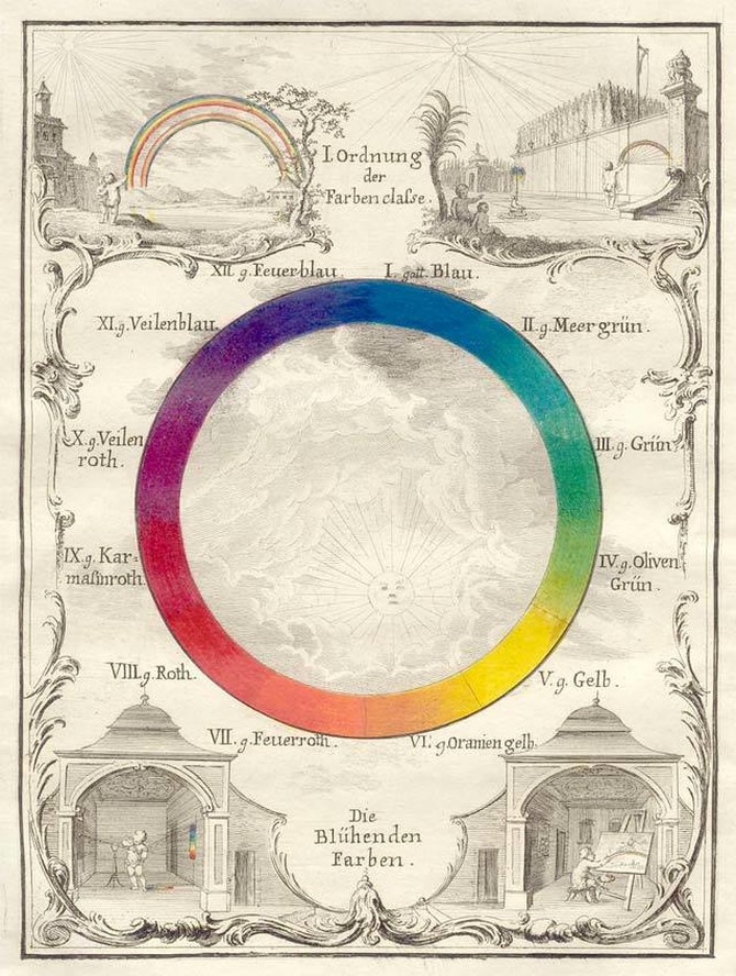
$primary: scale-color(complement($brand-color), $red: -50%, $green: 25%, $blue: 35%); We’ll generate the accent or primary colour (maybe your main button) from the brand, just by getting the complementary colour, which is the inner rule:
Code Sample
complement($brand-color)This just turns the colour wheel around 180 degrees and gets whatever is on the other side. It’s the same as adjust-hue($brand-color, 180 deg) but more self explanatory.
Now let’s scale the result. You’ll probably fiddle around with this scale so let’s consider what we’re doing with this SCSS. Let’s turn down that red channel and push a little towards teal to give us an on-trend look (everything is less red and more blue/green at the mo. Teal is where it's at).
Code Sample
scale-color(complement($brand-color), $red: -50%, $green: 25%, $blue: 35%);We want to scale this relational to the input, not manually change each colour value with adjust-color, because we want it to smoothly theme whatever the input is, and we want it to still be in the complementary zone.
If we put in, say, red, we still want to get a cyan out; if we put in lime green, we still want to get out some kind of pink. So obviously -50% red will always kick you out of pink: if you’re styling a tequila company, this is not the palette for you!
We could write a clamp function or maybe just bang in an interstitial step where we get the red, green and blue values and then redeclare primary for red, green, or blue leads, something like this:
Code Sample
$red: red($brand-color);
$green: green($brand-color);
$blue: blue($brand-color);

$lead: max($red, $green, $blue);

@if $green == $lead {
$primary: complement($brand-color);
@else if $red == $lead { make sure you don't scale out of cyan}
@else { don't scale out of yellow}
}
... But let’s just stick with our simple thing for now.

We don’t want to add specific (magic) numbers to a specific colour and then discover we’ve made something gross by mistake when the brand input updates. Secondly, we want to always make sure we get a visibly different colour value. We can’t just turn the hue dial 180 degrees as 180 from black is... black.
Code Sample
$secondary: darken(grayscale($brand-color), 12); We’ll grab a grey from the brand colour, just grayscale it, but we’ll darken it a little to give a helping hand to people with colour vision issues.
Code Sample
$tertiary: (lighten($secondary, 65%) * .88 ); Then we’ll get our light grey utility colour from secondary, but then let’s multiply it by less than 1, to make sure this value never hits 1 and blows out to white, if we’re branding from a light colour.
Final rig
Now we’ve rigged those up, let’s finally get our inactive state for the brand colour, by mixing tertiary with brand and then giving it a lighten so it’s always lighter than the active state. Oh we’d better put a tiny multiply on that too so we never hit full white:
Code Sample
$brand-color-inactive: (lighten(mix($brand-color, $tertiary), 22) * .95);And we’re done. Change the colour and see everything update.

