Arena Theatre
The little venue with big ideas- Branding
Part of the University of Wolverhampton, Arena Theatre has a reputation for inclusive programming in friendly, informal surroundings.
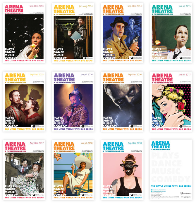
With its unique mix of professional and independent/amateur shows (including niche, disability and culturally diverse productions), along with workshops, talks, music events and community get-togethers, Arena is not just a theatre. So, we repositioned the organisation as 'the little venue with big ideas'. Those few words encapsulate the essence of the place and its ambitions.
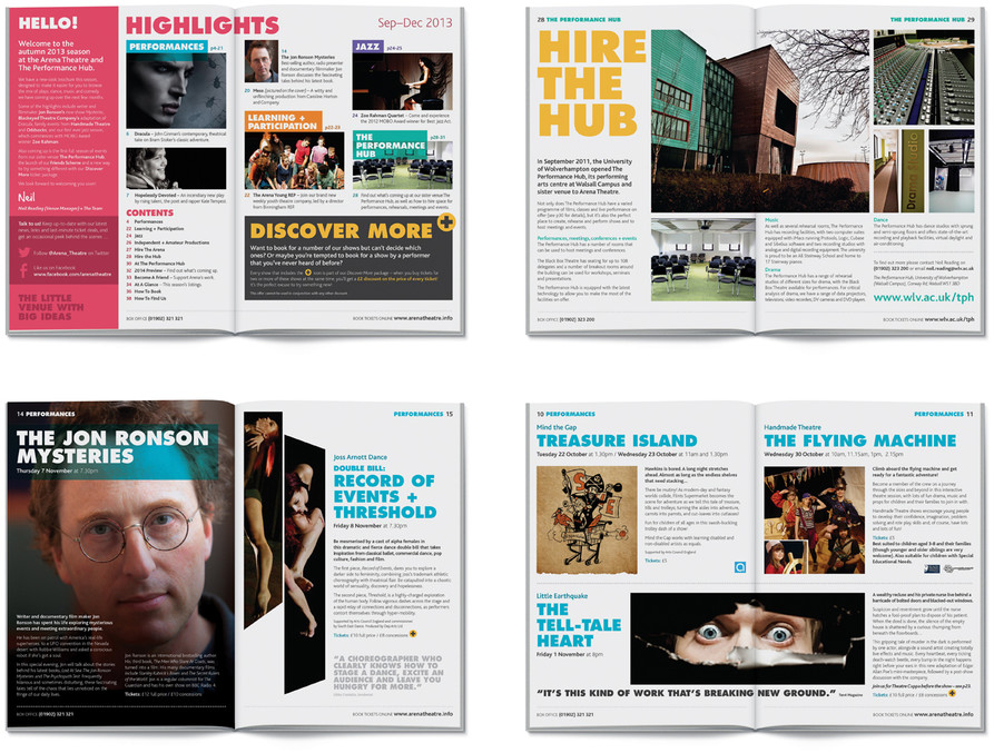
At the core of the visual identity is well-considered typography. The bold, uppercase display typeface is from the Bauhaus school; focused on unifying, appealing, accessible, egalitarian design, this fits perfectly with Arena.
The bright and welcoming colour palette was devised to work with existing interior design. Colours sit well together in all configurations, allowing gentle colour-coding while retaining the feeling of a single, cohesive and distinctive identity.


The primary application of the visual identity is season brochure – including a Large Print version for partially sighted audiences.
A simple grid structure keeps content easy to browse and read, but is specifically designed to allow variety within layouts. Consistent without being samey, this relaxed but clear editorial style epitomizes the Arena's informal and inclusive personality.

Supercool listened well to our ideas and then turned them into a new identity that was better than anything we imagined … such an easy company to get along with.
Neil Reading – Theatre Manager
Have a new project in mind? Let’s talk
Next project: Sheffield Theatres