Creativity vs. Convention
When should websites embrace creativity – and when should they stick to what's tried-and-tested?
Working with creative people is one of the best things about working in the culture sector. It’s not only Artistic Directors and artists who bring that creativity. Often the people behind the scenes at cultural organisations have creative backgrounds, and a creative mindset too.
This creativity can be applied in all sorts of ways day-to-day – including during new website projects. But when should we capitalise on that creativity to look at things in new ways? And when should we stick to a tried-and-tested conventional approach?
When it comes to websites, there’s a temptation to reflect the creative work at the core of your organisation. Your brand might be playful, experimental, exciting, and irreverent – so it's understandable to want to bring all those ideas into your website. But …
Sometimes creativity can get in the way of usability. Although it’s a fun distraction to, for example, try and catch a moving object on the screen – should this really happen when a user is simply trying to complete a task or transaction?
Despite coming from a good place of wanting to provide some 'delight' or a bit of fun for users, websites or features that push the boundaries of best practice can often cause issues for end-users.
What do we mean by ‘convention’ and ‘best practice’?
Convention and best practice in website design and development are broad terms that cover a number of areas, including User Experience (UX), Search Engine Optimisation (SEO), accessibility, compliance, usability, and device compatibility.
So, for example, best practice can mean ensuring your website is accessible by avoiding insufficient colour contrast, and making sure that it can be navigated via just a keyboard. Best practice can also mean being legally compliant around data privacy and security.
At its heart though, adhering to best practice makes websites easy to use. It helps to build trust and confidence with users - because, as they move around the web, the patterns they experience elsewhere also exist on your website.
Users behave the same way (mostly!)
We can use content and design elements to nudge users to engage with certain content in certain ways, however, research strongly suggests that there are consistent common patterns within user behaviour.
Once we understand these patterns, we can use that knowledge to help optimise our webpage design. This enables us to provide people with the information we need / want them to have, and those users also get what they need from the page. And that all happens seamlessly, and within seconds.
So, straying from these common patterns is risky. That doesn’t mean we shouldn’t do it, but we do need to acknowledge that if we do decide to design ‘against’ common behaviours, we’re asking users to put more effort into using the website. And that risks confusion, frustration, and perhaps even them just giving up altogether.
What do ‘convention’ and ‘best practice’ look like?
You’ll be aware of conventional design patterns on websites, even if you don't realise it.
We often see common patterns across similar sectors – when booking a hotel room, or a flight, or ordering online from a supermarket – the fundamentals will usually remain consistent across different brands.
And that's because certain conventional patterns are efficient and effective.
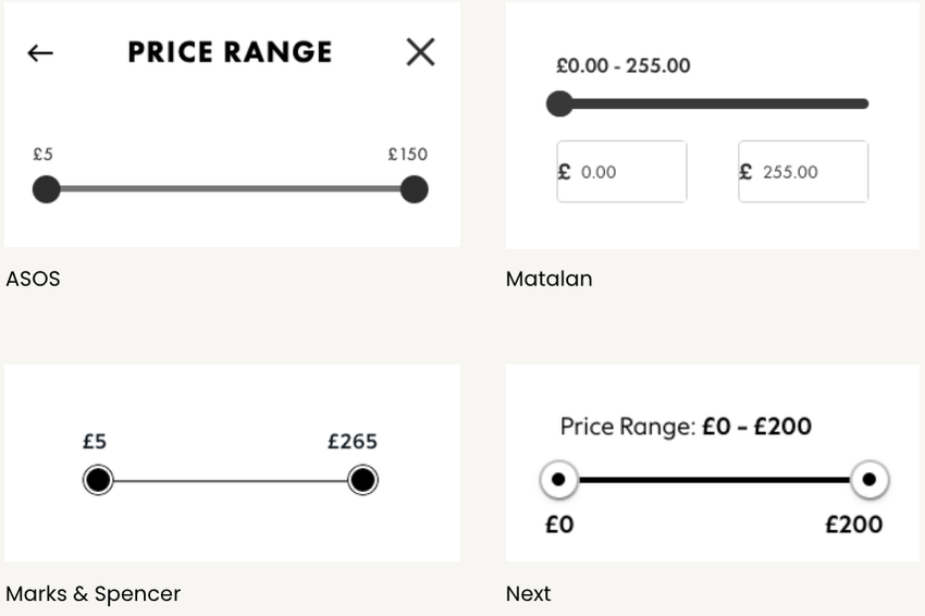
From the handful of examples above, despite being from very distinctive and different brands, we can clearly see some common patterns emerging with how filtering by price range is presented to users:
- There's an interactive 'slider'
- There's a set of lowest and highest amounts – sometimes with the option to type in exact amounts as part of the interaction
- The design is really pared-back – with the only hint at brand identity being the fonts that're used
There are also conventions when it comes to layout of content, and types of content, added to a page:
- A logo will often sit towards the top left of a website
- Editorial content frequently follows the Headline > Summary > Image convention.
- Main menus will usually be placed behind a ‘burger icon’ or similar on mobile, rather than showing all the items on the screen
Sticking to these conventions keeps a website straightforward to navigate, without requiring much thought on a users’ part because it removes any confusing barriers or trip hazards, and keeps interactions quick and seamless-feeling.
Essentially, it makes the experience intuitive – and the more intuitive your website is, the more time and headspace and goodwill users are likely to have to properly engage with your content and take some kind of action (signing up to a Mailing List, buying tickets, making a donation).
You might find this useful: How to create engaging calls-to-action
What does 'convention' look like for cultural organisations?
In 2024 we presented at Ticketing Professional Conference following a research project into event listings on cultural organisation websites. We looked at 100 cultural organisations and found common patterns in how they present their events, these included:
- Every website used an image for each event
- Every website displayed the event title and date on the list view
- Just under half included a summary for each event
- 84% offered filtering tools
- 17% had a price filter
- 5% promoted something other than events on their events listings page (e.g. promoting memberships or food and drink)
We can see from these figures that there are some conventions, and users will come to your website with expectations. When we consider commerce websites outside of the cultural sector, we can start to build a pattern of what users expect to see:
- They need the facts up front – name, date, time
- An image can help give an idea of what to expect during the event
- And for more unusual events, additional information and background detail can speed up a user's understanding of what to expect
The 'inverted pyramid model' in our guide on How to write great web copy may be helpful
Should everything just be the same, then?
No, not necessarily. But yes, in some cases …
If all websites were identical, they’d be easy to use. But people would struggle to know which website they were on at any point.
A good website should build on your brand's recognition and reputation, foster trust, and help to deepen relationships with your audiences and supporters. A successful website will carefully balance a certain level of creative brand messaging with convention.
By sticking to convention – therefore keeping your website easy to use – for the most practical, transactional information and tasks, your users will have more headspace to absorb your brand messaging.
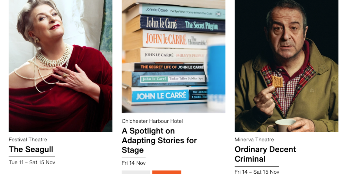
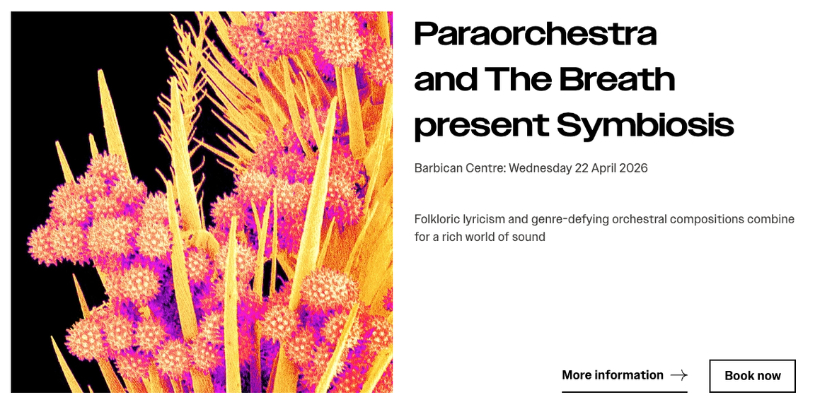
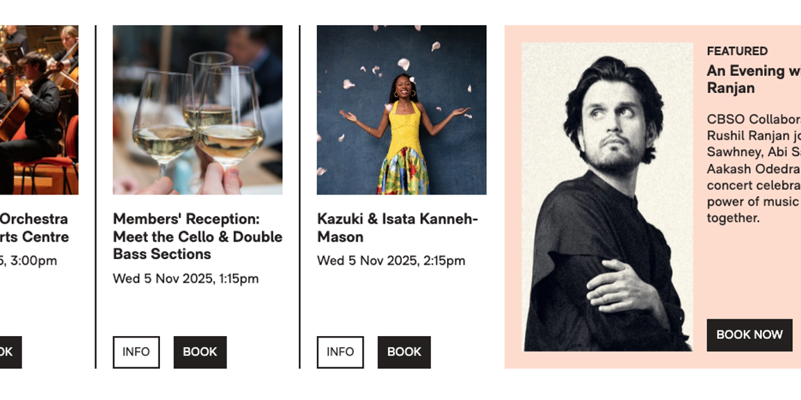
In the following example images of cultural website 'event cards', they all follow a similar pattern and contain broadly the same sort of content. But the websites themselves are totally different from each other, and chock-full of individuality and personality: Chichester Festival Theatre, Paraorchestra, City of Birmingham Symphony Orchestra
Cultural website event card examples
Showcase your brand
There are lots of opportunities to showcase a brand on your website.
Your brand typeface, colour palette, graphic elements, and tone of voice all combine to distinguish your organisation from others, while still fundamentally following convention.
But choosing where to apply your creativity is important.
As the examples above show, when it comes to highly functional areas that are key to driving transactions or engagement with content, it's best to stick to convention. But for things like call-to-action banners, you can be more playful.
It might be useful to think of it as dialling your brand up or down, depending on the action. For example, your homepage can be bold, brand-led and full of personality. Turn it up to 11! But when it comes to your purchase path for securing tickets to the next big show, users need conventional patterns (and they're already sold!) – so keep that branding subtle.
Some practical ways to highlight your personality on your website:
Personality, Purpose + Heart: Part 1 / Personality, Purpose + Heart: Part 2
How can I find the right balance of creativity and convention?
Our top tips for your next new website project or feature:
👉 Use convention – but make it your own
Don't be afraid to look for existing patterns and conventions within user journeys, content layouts, and interactions. Including looking outside of the sector. This not only keeps it simple for users to understand, but is also tried-and-tested so you know, fundamentally, it works.
But then ask yourself “How do we make this ‘ours’?” Consider where you can weave-in elements of your brand, snippets of organisational personality – without creating a barrier or trip hazard. An excellent example of this is through your use of language. For example, a book festival might invite people to "Bookmark" an event, rather than "Save" or “Favourite” it.
Check out some more tone of voice examples: Having fun with tone of voice
👉 Stay user-focused
Think about the user. What is this person trying to do? How invested are they? How much of their attention to do I have? And make sure to create a user journey that works for them – not one that works for you. And if you can, we'd recommend doing testing with 'real' users. Watching people use your website is so helpful, and will quickly tell you if creativity has got in the way of convention, and made user journeys difficult on your website.
Further reading about user testing:
National Museums Scotland – putting users first
How user testing helped improve Bishopsgate Institute's website
Common user testing issues and how to fix them
👉 Finally, remember your end goal
Ultimately your aim is to provide people with a fun, joyful, creative, inspiring, life-affirming experience. However, it's okay if your website focuses on achieving that goal more ‘quickly’ than ‘creatively’. Because it's the experience – that you're sharing with, presenting to, and producing for audiences – where the creativity really shines through.
👉 To get our "brilliant, informative, and entertaining" monthly newsletter – join the Supercool Mailing List