How To: Write Good Alt Text
What is alt text, and why is it important?
'Alt text' is a contraction of 'alternative text'. It's a short written description of an image, which makes sense of that image when it can't be viewed for some reason.
Well-written alt text is important to your website's accessibility, and its search engine optimisation (SEO).
Accessibility
It's read by screen readers in place of images, allowing your image content to be accessed by people who are blind or have visual impairment
It can be useful to people with certain sensory processing and/or learning disabilities
It's displayed in place of the image in browsers if the image file hasn't loaded, or when the user has chosen not to view images.
SEO
Because good alt text provides semantic meaning to, and a description of, an image, it's used by search engines to return search results. Thinking about that in another way; good alt text gives search engines more – and better – information to rank your website with; so they'll rank it higher.
The more thoughtfully and helpfully you describe all of your content to users, the easier it is for search engine robots to understand as well.
Tips for writing 'good' alt text
Adding useful alt text to images is one of the easiest ways to make your website more accessible. But it's not necessarily an easy thing to get the hang of – and can even harm accessibility if done poorly. No alt text is better than bad (i.e. annoying or meaningless) alt text.
Here're some tips to help you get it right:
1. Be specific and succinct
Describe the content of the image without editorialising. Say what you see – and don't make assumptions about ethnicity, gender, what's happening out of shot, a subject's motivations etc.
But do be descriptive about what you can see – adding information about skin tone, hair colour/style etc. will help to build the picture for someone who can't see the image.
One of the best suggestions I’ve heard is to think how you’d briefly describe the image over the phone.
A few words will usually be enough; though sometimes a full sentence is necessary. Bear in mind that screen readers may cut-off alt text at around 125 characters, so best stick within that limit. (Errr, usually – have a read of the context caveat)
2. Never start with “Image of …” or “Picture of …”
It’s going to be obvious to either a person or a machine when something they're accessing is alt text.
Imagine how frustrating it'd be using a screen reader on an image-heavy page, and having it read: "Image of the theatre" "Image of front of house area" "Image of exterior signage" "Image of the box office team" "Image of the auditorium" "Image of the stage" … arrrrgh!
However it is good to help people understand context, so explaining the type of image – e.g headshot, illustration, chart, screengrab – can be useful.
3. Use keywords sparingly
If, when describing an image, you can sensibly incorporate a top keyword or two: great. This will help with your SEO. But only when done truthfully and sparingly.
Search engines can’t recognise contextually ‘bad’ (i.e. unhelpful) alt text; but you may be ranked-down for keyword stuffing. Google can tell! So, your primary focus must be to describe any images requiring alt text specifically and succinctly.
4. Include text that's part of the image
Where text is included as part of an image, be sure to transcribe it as part of your description. Unless it means repeating yourself …
5. Don’t repeat yourself
Alt text isn’t needed if it'd repeat what’s already on the page. For example, an adjacent caption. Or if an event 'image' is a heavily-designed title treatment and you’re already on the event page – no need to add the title of your show as alt text. Why? Because it’s already there in the page heading.
6. Don't add alt text to 'decorative' images
'Illustrative' images are things like photos of your venue, or press stills from a show. They help to convey information, in context. 'Decorative' images include things like page dividers, or brand graphics. They make things look nice, or visually break-up content on a page. They don't have any contextual significance or meaning, so won't help people understand the page better if given alt text.
Ideally any decorative images should be included within your code rather than added as ‘content’. If they need to be uploaded as images, however, not adding alt text is fine – screen readers will simply skip over them, which is what we're after in this scenario.
The context caveat
i.e. when to ignore Tip #1 and add more detail
When the main focus of your content is an image, and/or when the emotion conveyed by that image adds something extra to the content around it, you may choose to describe that image with longer, more detailed alt text.
When an image is the main focus of your content:
Some good examples of highly detailed alt text are NASA’s descriptions of images taken by the James Webb Space Telescope, which they shared on Twitter. These incredible, wondrous and complex views of the universe demand highly detailed descriptions.
For example, this is only about one-third of the alt text for an image of the Carina Nebula:
"The image is divided horizontally by an undulating line between a cloudscape forming a nebula along the bottom portion and a comparatively clear upper portion. Speckled across both portions is a starfield, showing innumerable stars of many sizes. The smallest of these are small, distant, and faint points of light."
Conveying emotion through alt text:
Images don’t solely give practical, specific information but can also convey emotion. This is especially true within the arts. For example, describing a stage set, characters’ costumes, positions, and their facial expressions may not fully explain the image to someone who’s unable to access it.
Is that a smile of joy and happiness? Or is it clearly masking a deep and desperate sadness? What emotions do you feel when looking at the image – and can they be (sensibly) translated into alt text?
Being aware of context means you can allow yourself to write more creative alt text from time to time. But, while there are occasions that allow for more creativity than basic 'best practice' guidelines suggest, tip #1 – Be specific and succinct – still stands true most of the time.
Test your alt text:
Read your image descriptions aloud, within the context of the rest of the content on the page. If it makes sense and adds something useful – that's good alt text!
Alt text examples

Bad: We're zoomed-in on the face of a brown bear – sometimes known as a grizzly – gazing majestically into the middle distance. Perhaps she's hungry, or has spotted a threat?
If you need to say this much, add it as part of the text on the page. Keep alt text short. And remember – do not make any assumptions.
Bad: bear, brown bear, grizzly, grizzly bear, mammal, carnivore
Read this aloud. This is not helpful – and Google won't like it.
Okay: Brown bear
This is fine but you could describe the image more clearly.
Good: Close-up of a bear's face
This gives a clear understanding of what's in the image within just a few words, and makes no assumptions. (I'm not totally sure what type of bear this is ?)

Bad: Sign
This is really unhelpful – what does 'sign' mean? Is it an instruction to add a signature? Sign language? A star sign? Having no alt text would be better than this.
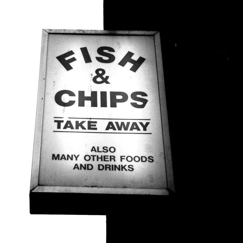
Bad: takeaway, take away, fish and chips, fish, chips, shop, food, fast food
Stop keyword-stuffing!
Okay: Take away sign
Not bad, but could do better …
Good: "Fish & chips take away" sign
A clear description of the image, including text from the sign but without going into excess, unhelpful detail. We don't need the additional text "Also many other food and drinks" in order to clearly understand the image.

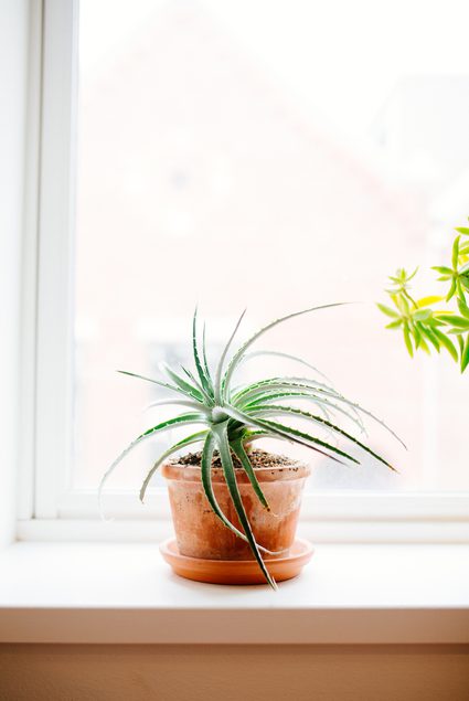
Spiky green houseplant in an orange pot, on a window sill
Bad: House plant on a window sill
What's wrong with this? It's descriptive, clear, short … ? It's repeating the caption – no need!
Good: {nothing}
With a caption that describes it nicely, no alt text is good alt text for this image.
Interested in further improving the accessibility and inclusivity of your website?
You may like our popular article, How To: Write Great Web Copy. We also have a handy collection of free Access Resources
