User testing the British Library Events website
How robust user testing helped us to create an excellent user experience

When we were commissioned to build the British Library Events website, we decided to run the project with deliberate 'pauses' built into the schedule. This allowed us to evaluate our work, and make meaningful, iterative improvements.
The main focus of our evaluation was user testing. That testing consisted of guided online sessions, during which individual users were set several tasks to complete on the website.
We observed each participant carrying out each task, noting any areas where they struggled — and indeed any areas they got through easily.
We’re well-versed in creating user-friendly websites so, thankfully, there were more successes than struggles. Phew! But monitoring users in action did reveal a lot of interesting and useful observations which helped us make the website even better.
Who were our users?
Before we get to the juicy details of what we found, it’s useful to understand the process in a little more detail.
We recruited users with the help of Indigo’s Audience Panel, a nationwide bank of willing research subjects, with an interest in the cultural sector.
They helped us select a representative mix of users spanning different parts of the country, different ages, and even different levels of familiarity with the British Library – so we could be certain we weren’t testing in an echo chamber.
What and how did we test?
We ran user testing across as much of the full website user journey as was practical – within a strict time limit! From searching out information, to browsing filtered events, through to purchasing tickets.
Each guided session lasted 30 minutes, and each user was given the exact same tasks in the exact same order, following the exact same script, read by the exact same facilitator. This meticulous consistency meant we could be certain that our results were truly comparable, rather than some users getting differing instructions (or hints!) from different facilitators.
Finally, the sessions were recorded and carefully coded, following the same criteria. Again, so we could be sure we were counting successes and failures in the same way across all sessions.
It’s hard work doing user testing! Particularly for that poor, hard-done-by facilitator who had to sit and listen to recordings of themselves asking the same questions over and over and over and over again … 💀
What did we find out?
Chapter 1 – Initial observations
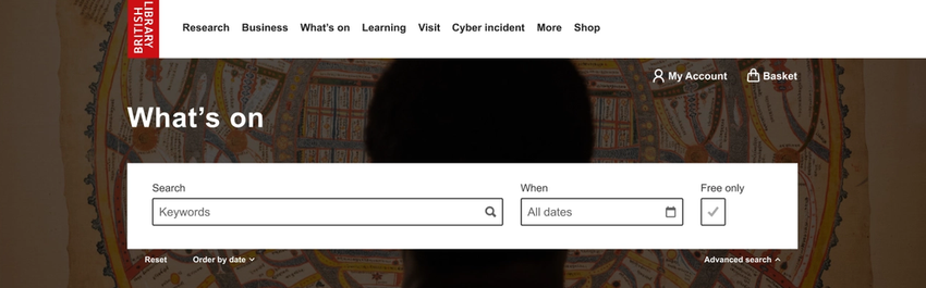
The main thing we noticed initially is that a user's first impression of a website massively influences their whole experience, for the rest of the time they spend on it.
For example, on the Phase 1 version, the navigation options shown at the top of the page read “Research”, “Business”, and “What’s On”. So, when we asked at the start of the session who the website was for, most users said it was for researchers, businesses, and event goers.
Likewise, on the Phase 1 version, thinking we didn't want to overwhelm people with information, we hid most of the event filters behind an “Advanced search” dropdown, instead we offered a prominent Search bar. As a result, most users didn’t even realise there were filters beyond that Search bar.
This might have been okay … except the users who did find them used them much more extensively than the Search bar. So we were hiding a tool that most users would have found useful.
We also found that users are in a hurry! They often used the event 'cards' on the listings page as their sole source of information, rather than clicking through to the full event page.
That’s fine when the summary information is complete. But event cards display truncated text. So, when asked who would be speaking at a particular event, for events with multiple speakers whose names didn't appear in that truncated text, many users missed them entirely. Rather than clicking through to the full event page, they only focused on the information shown in the event card summary.
Although we didn't make any changes to the interface design based on this observation, it did offer valuable guidance to the Library team when deciding what information to include in that summary blurb.
Chapter 2 – A whole new look!
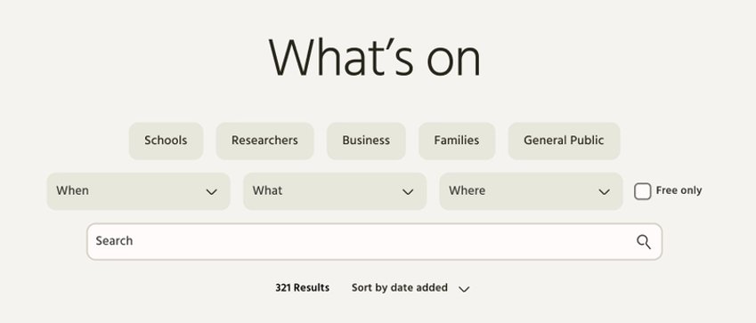
The next version of the website involved a dramatic visual redesign, to bring it in line with a newly relaunched main website (designed and built by another agency). This major design change was the perfect opportunity to address some of those earlier findings, too.
In this Phase 2 version of the website, we revealed all the advanced filters by default. And positioned them above the Search bar to avoid any chance of users missing them.
More importantly, because we knew how much those initial words impacted first impressions of the website, we exposed the “Who” filters as clickable buttons – making it much clearer that researchers and businesses are not the Library's only audiences.
The effects of even these simple changes were impressive! Now when users were asked who the website was for, “Schools” and “Families” came up much more often alongside “Businesses” and “Researchers”.
Likewise, in the first round of testing, many users had been surprised to discover, deep into the session, that the British Library offer events and services outside of London. Now, with that “Where” filter clearly displayed, users understood this much more quickly.
Better yet, now that the filters were visible, more than half of all users interacted with them to help them find specific information, rather than just using the Search bar. Compare that to the first round, where most users didn’t even realise the filters were there!
Perhaps best of all, in the second round of testing, more users described the site as “user-friendly”, “simple”, and “clear” — 7 out of 8 users in the second round of testing described the site this way, versus 4 out of 6 in the first round.
Our second round of testing had shown we’d solved a lot of problems identified in the first round. Result!
But it also revealed some new ones …
For example, while the interface design was praised as “clear” and “user-friendly”, words like “dull”, “basic”, and “boring” also emerged – words that hadn’t come up at all in the first round.
We also found that, with the new filters taking up much more of the screen real estate, it wasn’t always obvious that the results below were updating automatically as user a typed into the Search bar. Several users tried looking for a button, or clicking the search icon to try and 'submit' their search query.
So, Phase 3 was all about tweaks and refinement.
Chapter 3 – Finishing touches
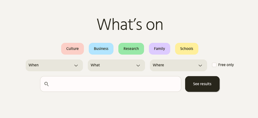
Now the “Who” categories along the top of the page pop with colour, making them stand out much more, while also making the whole page less "dull" and beige.
We also tweaked the Search bar to add a nice, big “See results” button.
The results still auto-update below, but now users who don’t realise it’s happening have something to do when they’ve finished typing. Clicking that “See results” button, or just hitting Enter on your keyboard, will now jump you down the page to where the results have loaded in.
Now everyone's happy! The users who didn’t realise there were auto-updating results, and the users who really liked the auto-updating results as it meant they didn't have to click a button.
What can you do next?
Some of the changes made based on our findings were minor, some much more fundamental. But we're in no doubt that the British Library Events website works so much better, thanks to robust and detailed user testing.
As useful as this kind of guided user testing is, however, it does take the kind of time and resources that many organisations don't have. Happily, there are also many more basic forms of user testing available that can yield valuable results.
Here are a few resources I hope are useful:
- Common user testing issues – and how to fix them
- Ditch the data – listen to your users
- National Museums Scotland – putting users first
Read more about our bespoke Tessitura-integrated event listings website for the nation's library: British Library Events website case study.
Want to discuss website user testing? Get in touch