Designing an inclusive website

There’s a lot to take into account when designing a website that can be used by as many people as possible.
Considerations for inclusive design (well, all good design really) cover everything from the navigational structure and mark-up, to the content – and visual design.
Here are some of the main things we pay special attention to during the visual design phase of any project, to keep the websites we make accessible:
Typeface

“Keep it simple” is a good rule of thumb for lots of things; not least your choice of typeface. Unfussy fonts with easily recognisable characters and few flourishes are easiest to read. For everyone.
Typeface choice is led by brand identity, but sometimes it can be sensible to use different fonts online. (While always making sure everything gels and ‘feels’ like the same brand.) On Bristol Old Vic’s website, we use a different body copy typeface than on their printed materials.
Fonts with a large x-height are ideal for use on the web. And if you’re going super-in-depth there’s an optimal ratio between the x-height and the stroke width. (Character stem stroke should be 17-20% of the x-height.)
It’s also important to choose sensible ‘like-for-like’ fallback fonts, in case your chosen fonts don’t load. Test these to make sure they don’t break the design, which they shouldn’t if your design framework’s robust.
Setting elegant, clear, big type is important. Most people will leave a website rather than change the settings on their browser. Clear type size is especially important on smaller devices. We make mobile body copy as big as possible while keeping line lengths sensible, and allowing for size differentiation and clear hierarchy of text.
Colour
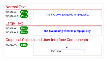
Contrast between text colour and background (called the luminosity contrast ratio) is super-important. This includes text on images, icons, buttons, and as part of maps, diagrams etc.
High contrast helps people with low contrast sensitivity (usually older folks), those who're colourblind, and anyone trying to read a website in glarey lighting conditions – like sunlight.
Early in a project we’ll use WebAIM’s Colour Contrast Checker to test accessibility of brand colours. If they’re not legible, we may be able to tweak colours a little to pass accessibility tests. Alternatively, we can use colour in different ways.
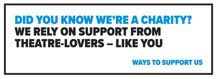
For example, Harrow Arts Centre have colour-coded What’s On genres but these colours don’t pass accessibility tests.
Instead of using coloured text or white text on coloured backgrounds we’ve incorporated the colours as highlights. So they’re an additional ‘disposable’ element. (In web development this called progressive enhancement.) It won’t impact someone’s use or understanding of the site if they can’t distinguish between colours, as the genre names are all legible and accessible.
We never rely solely on colour to convey information. Some people may not perceive colour changes, so make sure there’s an additional indicator.
Layout
Using headings, whitespace and proximity of elements all help to make it clear that different bits of content are (or aren’t) related to each other.
And space between components provides a rest for shakier hands, reducing accidental clicks. Whitespace is a helpful tool – as well as helping make things look good!
Segmenting information into chunks reduces clutter and makes content easier to scan; therefore understand. (There’s information about thePrinciples of grouping on Wikipedia if you’re interested in learning more.)
Calls to action
This is a mix of content and visual design. Calls to action need to make it super-clear to people: first, what you want them to do, and second, how to do it.
Limiting the number of calls-to-action on a page makes for better conversions. Rather than distracting people with lots of different choices, you’re leading them through the website towards specific goals.
Focus states
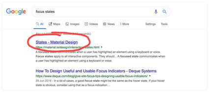
You know those lines that appear under text links in Google search results when you hover on them? They also appear when you tab through the results using a keyboard. This makes it clear what elements on a page are ‘clickable’ to someone using assistive tech.
Focus states aren’t always designed the same as the hover state, but should be present on all links, buttons, menu items, form fields and widgets (as a minimum).
In summary:
- Keep it simple with your choice of font
- Check colour contrast, and never rely solely on colour for information or interactions
- Segment information into clearly identifiable, manageable chunks
- Make sure calls to action are easily understood – and easy to action
- Don’t forget to design-in focus states for clickable elements
- Good design is inclusive design ?
For more tips and links to useful stuff for making your website more accessible, head over to our Access Resources.