Personality, Purpose + Heart: Part 1

How your website can better reflect your brand – AMA Webinar, 30 Sep 2020
On Wednesday, Kate and I presented an AMA-organised webinar sharing the biggest opportunities we've identifed to reflect your brand on your website. Over the previous month, we'd been busy running 1-1 consultancy sessions with more than 20 organisations all over the country.
The webinar and this recap feature the common findings and highlights from our experience, and those consultancy sessions. Including: quick-wins, practical tips, and shining examples of organisations* brilliantly adding personality, purpose and heart to their websites — without the need for a redesign.
*Of all sizes
Firstly, why is your brand important?
Of course, your website needs to be functional. You have business goals like selling tickets, data capture, and taking donations. And users are looking to buy tickets, find information, and be entertained. But there's more to your website than transactional, easy-to-measure functionality.
Advocacy. Belonging. A sense of understanding, and that emotional pull that draws people to you. Your brand is important for many reasons, but in this context we're most interested in:
- Building new audiences – it’s the hook that helps people understand what you're all about, and decide if you're a good fit for them.
- Retaining existing audiences and stakeholders – maintaining the relationship, growing engagement, and creating a sense of belonging.
- Communicating with everyone else – for those people on the fringes, your brand is a useful way of communicating what you do and what you hold dear; efficiently, effectively, and consistently.
Perhaps you've worked with brand consultants to define who you are, why you exist, and what you care about? (The more clarity you have around this, the easier it is to communicate it to others.)
What we're going to cover
We’ve focused on the areas that were most common in the bespoke reports we created. Some areas may be more relevant to your organisation than others, but most should be achievable without any fancy design or complex technical development.
An hour-long presentation's a bit much for one post – so it's broken-up into two parts:
This post, Part 1:
In Part 2:
Copywriting
Top-level navigation
Micro-interactions
✅ About us
An ‘About us’ page or section is a common convention. It’s the place users go to find answers to all kinds of questions. Content should be skimmable – giving a quick overview of who you are and what you do, with clear links to further information.
Things to think about:
- Make content skimmable
- Present your values
- Tell a story
- Talk about your impact
- Avoid Wikipedia-levels of detail
- Where are new users landing? Give them some info about you, right there
Some great examples:
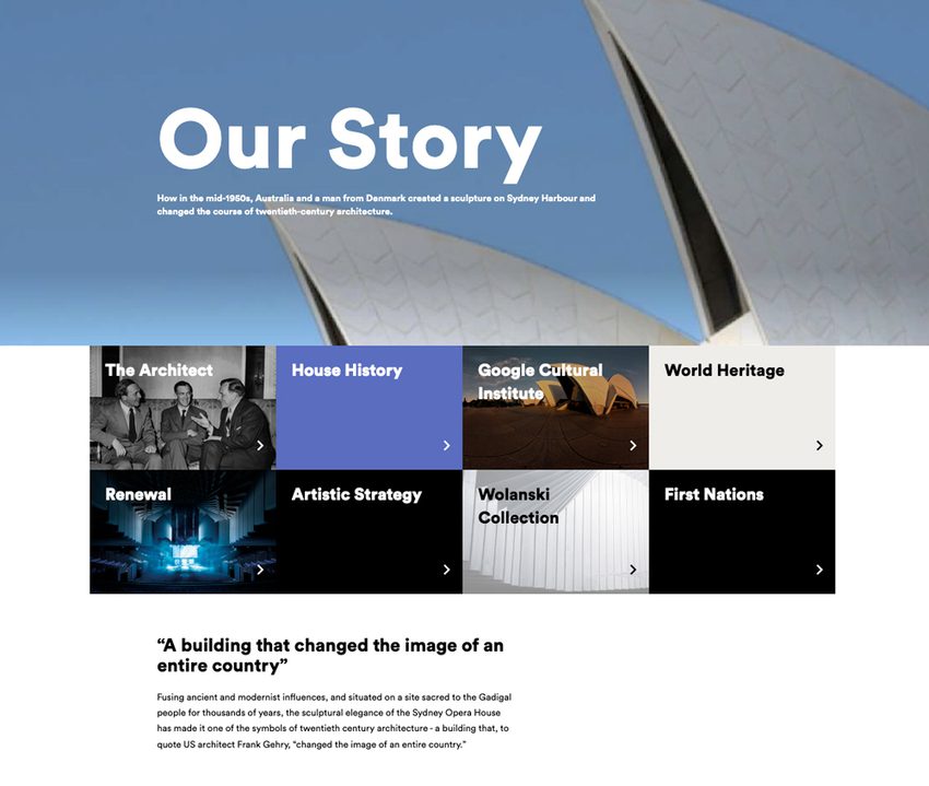
Sydney Opera House
- Easy-to-read, and a manageable amount of text
- Text is interspersed with headings, quotes, imagery and button links
- Includes clear image-led block links which also explain areas of the venue's work
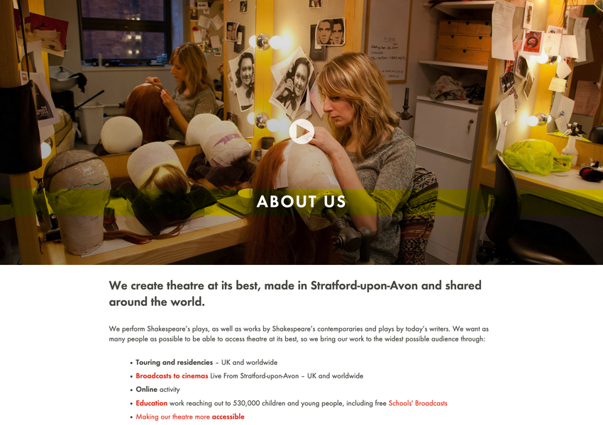
Royal Shakespeare Company
- Use of an intro video is great; but it's not the only way to find out more
- Content is clear and easily digestible
- Uses really simple text formatting, with inline text links
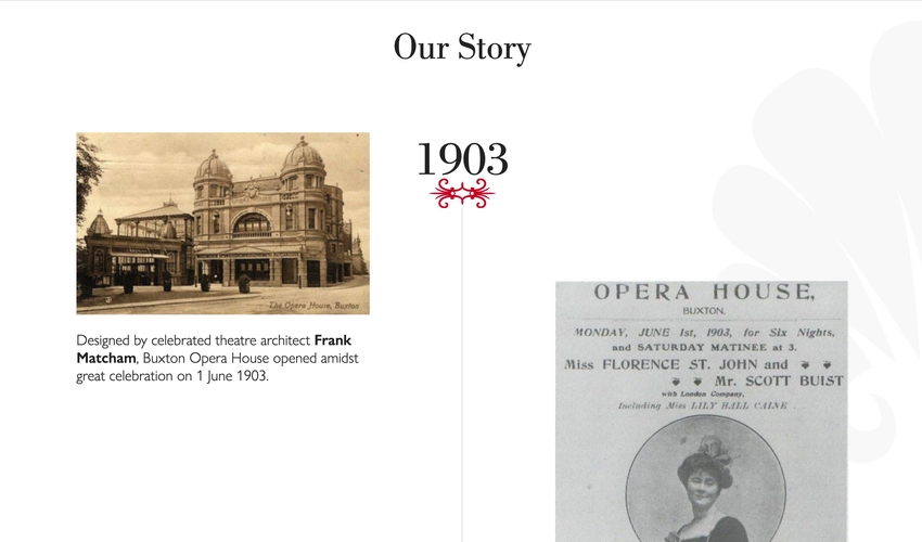
Buxton Opera House
- A different approach here, focusing on BOH's long, established history
- Timeline design is a nice touch, but similar can be done with simple text formatting, with image and video dotted-in
- Ends with a call-to-action
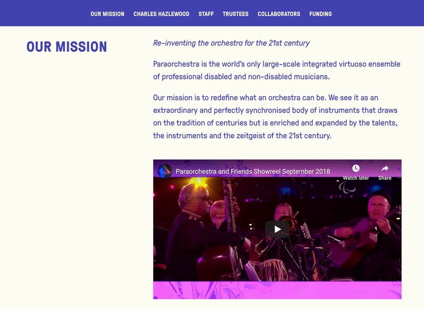
Paraorchestra
- Really nice example of a long, all-in-one About page
- Lots of info but avoids the common pitfall of becoming a soulless 'Wikipedia entry'
- Text is split into manageable chunks/sections, broken-up with sub-headings
- Nice use of image and video
- Introduces Paraorchestra's people really well
✅ Calls-to-action
Calls-to-action can be shouty and loud – like banners and buttons – or more subtle things like text links. But they always prompt people to 'do' something; sign-posting or nudging towards business goals such as ‘Buy tickets’, ‘Donate now’, and ‘Sign up to our mailing list’.
Things to think about:
- Review all of your calls-to-action together
- Incorporate your values into actions
- Use your tone-of-voice
- Keep the action clear
- Avoid dead-ends
Some great examples:
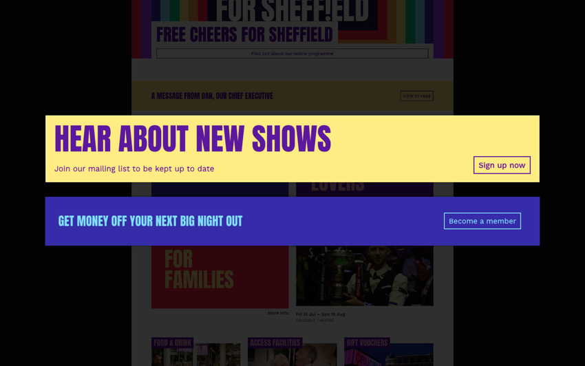
Sheffield Theatres
- Clear, bold statements fit with Sheffield Theatres' confident brand voice
- Use of the word 'your' speaks directly to the audience
- And 'Shows' (as opposed to 'Events' or 'Productions') reflects the language used by audiences
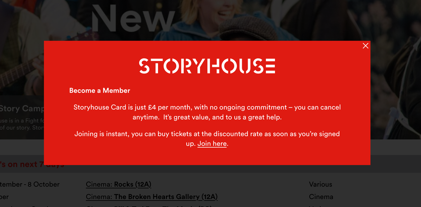
Storyhouse
- Calls-to-action don't need to be highly-designed
- Straightforward, easy-to-understand copy is likely to get the highest clicks
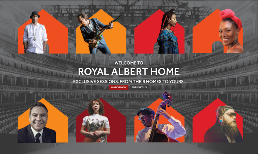
Royal Albert Hall
While the text around a call-to-action can be somewhat prosey, keep things like button text totally clear – so people know the action they should take, and are clued-in to where a link will take them.
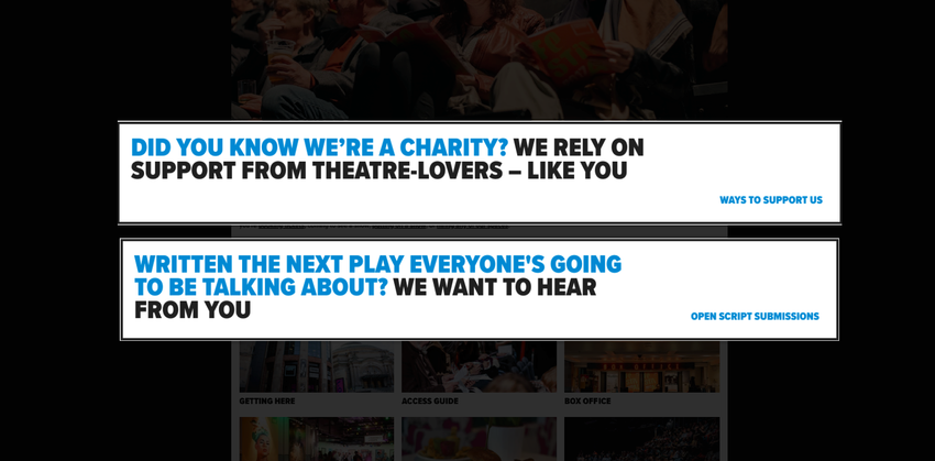
Traverse Theatre
As a new writing theatre, call-to-action banners are intentionally quite wordy – but there is a method and consistency:
- Starts with a question – hinting at a dialogue, not simply broadcasting
- Text speaks directly to the user i.e. "Did you know …"
Bishopsgate Institute
- Never leave users at a dead-end – add calls-to-action in your footer
- Surprising content can give people a feel for your organisation, and create a moment of delight e.g. Bishopsgate Institute's frequently changing archive image in their footer
✅ People
People love finding out about people! It helps us feel a closer connection. It makes the abstract more 'real' and human. So, who are the people that make up your organisation? Can website visitors find out about them? See what they look like? Read or hear what they think? Get to know them?
Things to think about:
- People help to build trust
- Promote your organisation's personalities
- Feature people in your blog content
- Tell stories from people behind-the-scenes
- Don’t forget your audiences – share their voices too
Some great examples:
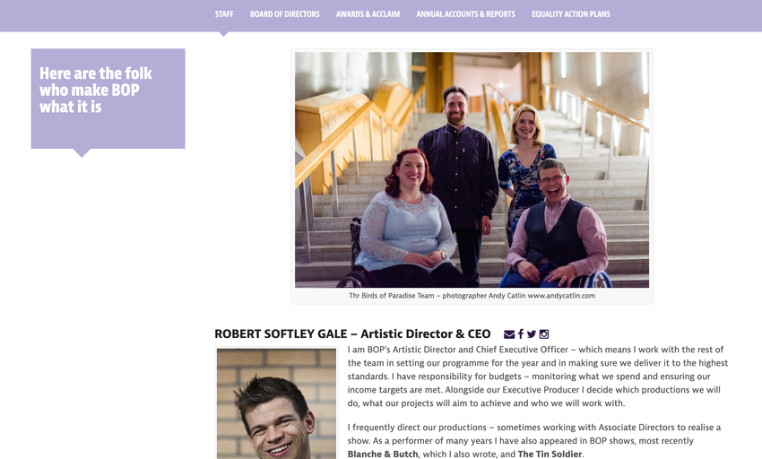
Birds of Paradise Theatre Company
- It's a bit tricky to do this at the moment, but a photo of the whole team together is a nice touch
- Informal headshots suit BOP – but whatever the style, it's good to be able to put a face to a name
- Short biographies written in the first-person makes it personal
- We love everyone's 'Contact me if …' lists, to help users understand who to get in touch with in various scenarios
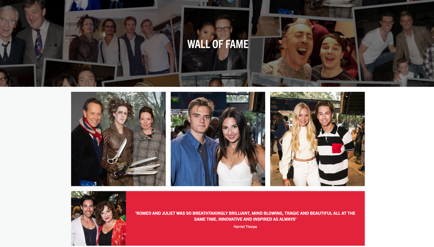
New Adventures
- New Adventures also have great pages for their dancers – including candid 'behind-the-scenes' shots
- The 'Wall of Fame' page is a popular page – a scrapbook of the company's famous fans and patrons (featuring photos and quotes)
- Do you have any famous fans, patrons, partners, performers you can highlight?
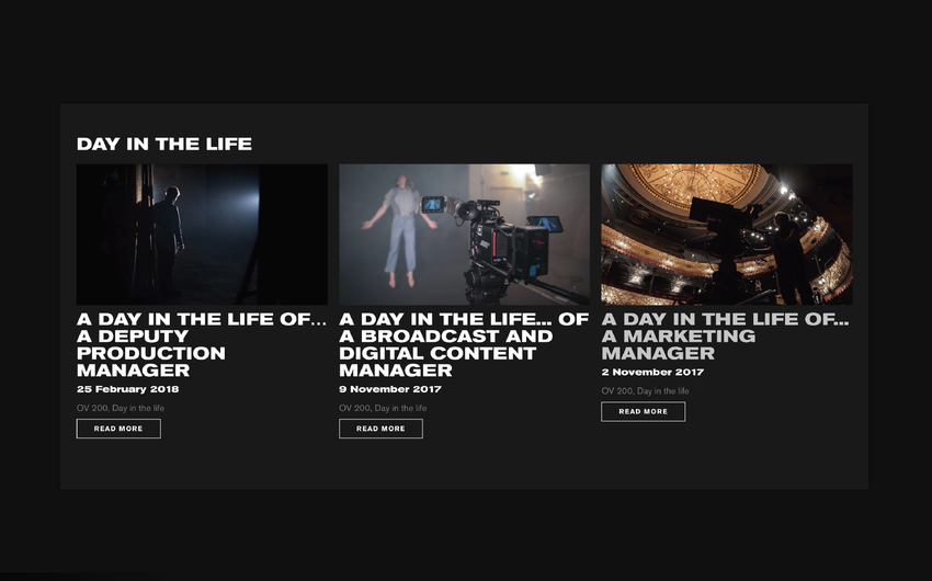
Old Vic
- Tell stories about people – even if it's your story!
- Old Vic's 'Day in the life' series is a nice way to profile people
- Also educates/reminds audiences about the more 'hidden' roles that are vital to the organisation
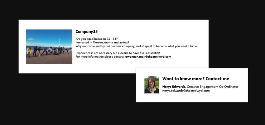
Theatr Clwyd
- Bringing people into your website doesn't have to include profiles or biographies
- Using direct, named email contacts (rather than 'info@', 'development@') is a good way to humanise your organisation
- Showing headshots is even better! It's no longer a faceless department
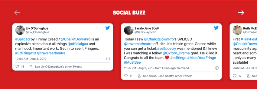
Traverse Theatre
- Don't forget your audience! Traverse Theatre include tweets from audience members on event pages
- This not only helps those people quoted feel closer to you – but can be useful for potential new audience members, who may need a nudge that your work is 'for them'
To talk with us about how your website could include more personality, purpose and heart, get in touch: james@supercooldesign.co.uk | kate@supercooldesign.co.uk