Personality, Purpose + Heart: Part 2

How your website can better reflect your brand – AMA Webinar, 30 Sep 2020
This is the second of a 2-part recap of our AMA webinar. We feature quick-wins, practical tips, and shining examples of organisations brilliantly adding personality, purpose and heart to their websites — without the need for a redesign.
If you've not read it, Part 1 covers: About us, Calls-to-action, and People.
Here in Part 2 we talk:
✅ Copywriting
Your personality as an organisation is, of course, much more than your visual identity. It's about why you exist. And that can be much easier to convey in words; yet the power and importance of good copywriting is often underestimated. Using your own tone-of-voice, following these simple copywriting tips can help audiences get to know you better. (By understanding you more clearly.)
Things to think about:
- Use your tone of voice – consistent with other comms
- Make time for copywriting; it’s an important part of your brand
- Speak the same language as your audience
- Consider making a list of the words you should (and shouldn’t?!) use
Might also be useful:
hemingwayapp.com– to check the reading age of your copy, plus whether you're using the Active 😊 – or Passive 🙁 – voice.
Our post How to write great web copy – practical tips to write better, and more accessibly, for the web.
Some great examples:
Glasgow Women's Library
"Glasgow Women’s Library is no ordinary library!"
"… we hold a wonderful treasure trove of historical and contemporary artifacts and archive materials that celebrate the lives, histories and achievements of women."
"Empowering women is one of our key aims."
"We have grown from a small grassroots project into the main hub for information by, for and about women in Scotland …"
- In just a few paragraphs, the copy covers: that they're different, what makes them different, why they exist, and where they came from.
- The tone is upbeat, positive, and passionate – you can tell they care.
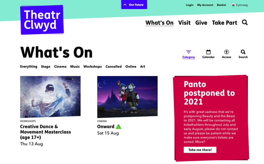
Theatr Clwyd
"Have you ever wondered how shows are put together and who does what? Wonder no more, as we interview …"
- Use the same language as your audience
- It's 'Panto' not pantomime (Oh, yes it is!)
- 'Shows' rather than productions or events
- Asking a question prompts people to think; to engage
Stan's Cafe
"We wanted an unusual name, but one that wasn't too aggressive, too posturing, a cheap joke, a bad pun or overly earnest."
"Neither of us knew of any companies resembling the one we wanted to form already in the city. We fancied being big fish in what seemed like a big pond."
"Oh yes and it's pronounced Caff."
- Approachable, casual tone of voice – includes some 'personal' history about their name
- Interesting way of explaining their origin story; proper storytelling
- Great to know it's pronounced caff, not café!
Frantic Assembly
"Can you be terrified and fearless? That is how we started Frantic Assembly. From a reckless leap into the unknown 25 years ago …"
- Frantic Assembly have great fun with words – 'terrified', 'reckless', 'brutal', 'fragile'. These words re-appear throughout the website
- They don't sound like any other organisation. (It's fine to say you're 'welcoming', 'dynamic', 'innovative' – but could you be more creative with copywriting?)
- Make a list of a few distinctive words to use – and maybe some to avoid! – to describe your organisation, your work, your mission, your origin …
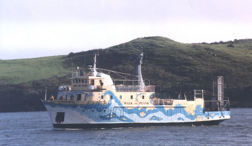
Walk The Plank
"It all started with a ship touring the coastline of the British isles …"
"… when we first persuaded a bank to finance the purchase of an old Norwegian ferry …"
- Intriguing opening line!
- Nice, conversational tone of voice that talks directly to the audience
- Uses clear, uncomplicated language but still has great warmth
✅ Top-level navigation
Bit of an unusual one this, but your top-level navigation – essentially the main menu – can be part of shaping a first impression for website visitors. Think about how your navigation items could be interpreted.
Things to think about:
- What does your main menu say about you?
- Design top-level navigation to help users, rather than replicating your organisational structure
- Don't assume people will click! Compelling calls-to-action throughout the website are more effective than expecting people to rely on your menu to browse
- Limit top-level menu items to around 5 – more than this and it's harder for people to process
Some great examples:

Main menu:
Art & Artists, Exhibitions & Events, Plan Your Visit
- Main menu titles may be long, but there're only 3 of them
- Sets-out Tate's stall – this is what they're about
- Note that these sections don't cover absolutely everything on the main site

Main menu:
What's On, Your Visit, Search
Second tier:
About Us, Donate Now, Get Involved, For Artists
- The biggest items are squarely aimed at the audience – and selling tickets
- Use of a smaller 'second tier' gives users more information without getting overwhelming
- Uses clear language
- 'Get Involved' tells people they can do something other than watch shows
- 'For Artists' is unlikely to get many clicks – but instantly tells people that Sheffield Theatres exist for artists as well as audiences
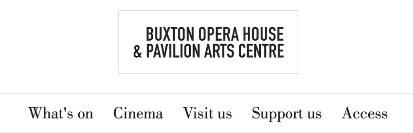
Main menu:
What's On, Cinema, Visit Us, Support Us, Access
- Separating What's On and Cinema demonstrates there's even more on offer than live performance
- Keeps to 5x main items
- Clear, understandable section names
- It's clear that Access is an organisational priority
✅ Micro-interactions
These are the little details – small moments of delight – and often-overlooked opportunities to keep users engaged, and convey your personality.
Things to think about:
- Error 404 page – but don't go wild with this! Remember; people landing here may feel frustrated
- What message do people get after signing-up to your mailing list? And is this reflected in the first 'confirmation' email they get?
- Where are ticket-buyers sent after purchase?
Some great examples:
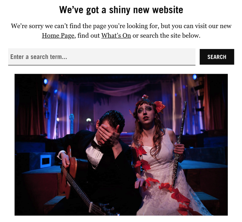
Battersea Arts Centre
Error 404 page
"We’ve got a shiny new website. We're sorry we can’t find the page you’re looking for, but you can visit our new Home Page, find out What’s On or search the site below."
- Remember users who hit a 404 page may be frustrated, so don't be flippant or too prosey
- Clear, simple, informal and explanatory error page messaging
- Includes text links to help users navigate
- Use of an image can work well, if you're able to add one
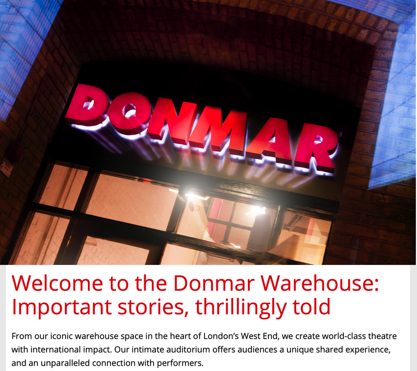
Donmar Warehouse
Email sign-up confirmation / 'Welcome' email
- Rather than a bland confirmation, you get a designed 'Welcome' email when signing-up to the mailing list
- Great opening line gives a sense of the Donmar and their work: "Important stories, thrillingly told"
- Email includes links to find out more, including: Membership, Workshops, and Access resources – even if people don't click these, they now know these things are on offer
Bristol Old Vic
Post-purchase 'Return' page
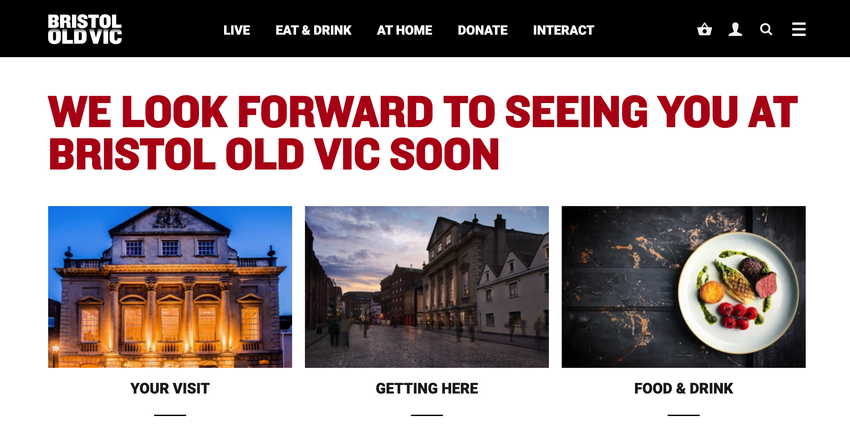
"We look forward to seeing you at Bristol Old Vic soon"
- After an online purchase, Bristol Old Vic ticket bookers are directed to a 'Return' page
- The page includes a nice, welcoming message – plus links to Your Visit, Getting Here and Food & Drink (as it's pretty likely these people will be coming to the venue, so would find this info useful)
- Reinforces that the 'action' the user's taken – i.e. ticket purchase – has been successful
- Takes the opportunity to speak to their audience directly
To talk with us about how your website could include more personality, purpose and heart, get in touch: james@supercooldesign.co.uk | kate@supercooldesign.co.uk