Preparing images for your website

Part of the series How to create great online images
The final post in our How to create great online images series – now you've created some great images, you're almost ready to upload them. But first …
This overview explains some of the technical detail and terminology it can be helpful for you to understand ahead of preparing images and uploading them to your website.
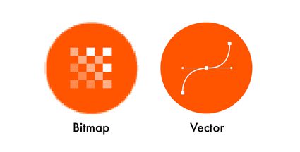
Bitmaps and vectors
Your images will be either bitmaps or vectors. It's useful to understand the difference, so you know which type of file suits different situations.
..
Bitmaps
Bitmap images are made up of pixels. (A pixel is a single-coloured dot.) They can’t be scaled-up any bigger than the original without losing image quality. They are best for displaying photographs, and complex images. File types include:
.JPG
Pronounced "jay-peg" / Short for: Joint Photographic Experts Group
Often used in digital photography due to the relatively small file size compared with image quality. Uses lossy compression (explained in 'Compression').
.GIF
There's some debate over how it should be pronounced (but it's definitely "gif" with a hard 'G'!) / Short for: Graphics Interchange Format
Compresses images to a maximum 8-bit colour depth, so it's not suitable for complex photos. Uses lossless compression – and can be animated!
.PNG
Pronounced "ping" / Short for: Portable Network Graphics
Uses lossless compression, and is useful when you want a cut-out photographic image with a transparent background.
.WEBP
Pronounced "weppy" / Also written: WebP
The newest file format, developed by Google, WebP offers 25-35% smaller than a .JPG, without loss of image quality. Uses both lossy and lossless compression, but requires the latest servers and browsers. (So, although it's not well supported right now, it's likely to become more widespread in future.)
Vectors
Vector images are constructed of lines, points, coordinates, and mathematical curves. They can be scaled to any size without a reduction in image quality, so are perfect for simple graphics like logos and icons.
Having said that, when a vector is displayed on screen, it will have been 'rasterised' – i.e. converted to a grid of pixels. File types include:
.SVG
Pronounced "ess-vee-gee" / Short for: Scalable Vector Graphics
It’s possible to change the size and colour of a .SVG file using code (HTML). This makes it great for graphs and infographics – or your logo, if it needs to be displayed in different colours or sizes across your website.
You may've come across other vector file formats in print – such as .EPS (Encapsulated Postscript) and .AI(Adobe Illustrator). Neither of these can be displayed by browsers.
TIP: Added to .EPS and .AI, other file formats browsers can't display include: .TIFF, .BMP, .PICT, .PSD, .PDF
Animated GIFs
Briefly mentioned above, animated GIFs are a fun way of increasing engagement with your content.
...
However …
Often, your website needs to be specially-configured in order to display animated GIFs. So, if you're unsure whether or not your website supports them, check with your web agency.
Depending on the length and complexity of an animated GIF, the file size can get pretty large (as there are a lot of 'frames' included to create that animation). But you can compress them, using one of the many free online tools.
Compression
I talked in the 'Bitmaps and vectors' section about about how certain image file formats use either 'lossy' or 'lossless' compression. What does that mean?
Lossy compression reduces a file's size by permanently removing data.
Lossless compression means that, as a file's size is compressed, the picture quality remains the same. Also, the file can be 'decompressed' back to its original quality.
Dimensions and resolution
An image's dimensions are the number of pixels (px) along its width and height. Resolution is the fineness of detail in a bitmap image, measured in pixels per inch (ppi).
In a world of responsive web design where layouts and images need to bend and flex to all kinds of different devices and screen sizes, it’s difficult to be specific about what dimensions are right for your images.
Currently – August 2023 – a typical large desktop screen is 1920x1080px. So, a good rule of thumb – if you intend an image to be shown full-screen, make sure it's around 2000px wide.
TIP: When adjusting an image's dimensions, make sure the height and width change in proportion with each other. You don't want a squashed or stretched image.
Unlike print where you'd be using a 300dpi (dots per inch) image for almost every printed item, screen resolutions vary. But if you're cropping your images to specific pixel dimensions to fit your website, you don’t need to worry about resolution. That will sort itself out.
⚠️ Large images require more energy to load and display them, which will increase the carbon footprint of your website. So bear this in mind when deciding what size to make your images. You can find more resources about this in our series, How to create a sustainable website ⚠️
File size and page weight
Not to be confused with 'image size' – which is the dimensions in pixels – file size is measured in kilobytes (KB) or megabytes (MB).
With bitmaps, the larger an image's dimensions, the larger its file size. With vectors, the complexity of the image defines its file size. So, the more points and paths there are, the larger the vector's file size.
Images are great at engaging, informing, and exciting audiences. But every image you add to a page increases the page weight (i.e. the amount of data every visitor has to download to view that page).
The average desktop website page weight in 2021 is around 2100KB. That may not mean much, until you realise that:
- A typical .SVG logo might be 10KB
- A (well-optimised) full-screen .JPG might be 200KB
- An animated .GIF might be 2MB
A good content management system – like Supercool's CMS of choice, Craft – will automatically display correctly-resized images, based on layout and device size. But your CMS can't do everything. There are lots of online tools that can compress images for you, before you upload them to your website.
Heavy pages result in slower page loads, higher bandwidth costs (for you and your users), and – importantly – they increase your website’s carbon footprint. So be mindful of file sizes – as well as the number of images – you're using.
I hope this overview's helpful next time you need to prepare images for your website. You can find articles about what makes a great image, how to choose and brief a photographer, and taking DIY product photos using your phone in our series, How to create great online images.
ONE FINAL TIP: Once you've uploaded your images, remember to add Alt Text – to improve accessibility and search engine optimisation. Find out more in our article How to write good alt text.
Sign up to the Supercool Mailing List for more handy resources, sector insights, and invitations to our FREE online talks and events.