Words to the wise – accessible copy and content structure

This post focuses on making sure the way you describe your organisation, and the things you sell, is clear and understandable – to everyone.
It's the second in a series based on a talk I gave at AMA Conference 2023 about the importance of language to online user journeys.
Literacy in the UK – a quiz
Before we go through some examples of copy on websites, here’s a quick quiz to find out what you know about literacy levels in the UK:
- What percentage of adults in the UK have literacy skills at or below Entry Level 1? (This is equivalent to literacy levels at age 5-7. Adults with literacy skills below Entry Level 1 may not be able to write short messages to family, or read a road sign.)
- What percentage of people aged under 30 go to university?
- On average, how long do people spend on a web page containing 1,000 words?
How did you do? Spot on? Not far off? Nowhere near?
Now that you're armed with those statistics, how might the answers to those quiz questions change if – rather than the UK adult population as a whole – you were looking at yourself or people like you, and the people you work with?
Chances are that you and most of your colleagues went to university. (Shout out here to the amazing work Non-Graduates Welcome is doing to make the sector more accessible to people without higher education qualifications.)
You probably have a higher than average level of literacy. And you'll be paying very close attention to the content on your website – editing, proofing every word, and crafting the content to be just right.
But that isn’t representative of how a lot of your website visitors are engaging with your content.
How do we read online?
We don’t read online, we scan.
There’s a lot of research that backs this up – including some clever eyetracking, which records all the minuscule eye movements that people aren't consciously aware of when looking at a web page.
The data shows that people usually scan pages in either an F or Zig-zag pattern. Understanding these patterns can help you to design effective content and page layouts, with the user in mind.
Read more about these patterns, and how to apply them, in our blog post: How to create engaging, effective calls to action
Challenges
Ahead of our AMA Conference session, I ran a series of roundtables with people from across the cultural sector. When it came to website copy, we discussed a few key challenges:
- Writing skills in the organisation
We had a great discussion about digital natives, and how difficult it is for some people to write for the web. A lack of skills across the organisation means the task of ensuring web copy is well-structured, accessible, and supports SEO, sits with very few people – sometimes just one.
- Lack of time
No one has enough time to really craft and hone the content on the website so it’s perfect. The cultural sector is in a unique position where your products (events and activities) are constantly changing and new ones are coming up all the time. Nothing stays static long enough to get the time it deserves.
- Knowing how to measure success
Lots of people spoke about the challenge of measuring success. Whether it was event copy or editorial copy, people weren’t sure what to measure, or how.
Ideas and solutions
When discussing event copy, participants in the roundtables shared some great advice and strategies. Here are two of my favourites:
Use ticket sales data to inform where you invest time
One festival puts all events live on their website with the original copy they're sent from the programming team, producers, or artists themselves. Once the initial rush of ticket sales has slowed, they review which shows are selling fine, and which need more of a push. They then invest time tweaking and improving copy for those shows that need to sell more. This is much more achievable than rewriting/editing copy for every single event.
Listen to the music yourself
A team member at a festival that programmes a lots of jazz invests time listening to the artists’ music – then adjusts the marketing copy so it’s more accessible; often by finding similarities with well-known music artists as a ‘hook’ for jazz newbies. This is a significant time investment but an effective way to describe a potentially niche programme in a way that speaks to new audiences.
Some more ideas for making your content more accessible:
? Don't write like an academic
A trap we can often fall into is writing like we're academics. That’s because many of us in the sector went to university, where this kind of style is expected.
We invest a lot of time and energy into research, and we really value what we find out and want to share it all – explaining the background, and providing lots of convincing, persuasive detail.
Which can result in content that reads a bit like this:

But remember that people skim-read online.
So, you need to get to the point clearly and quickly – like this:
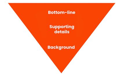
Sometimes called the inverted pyramid model and often used in journalism, this approach is great for time-pressed users who are scanning your web page for keywords. It helps them to quickly answer the question “Am I interested in this?” – and gives them the opportunity to delve deeper, if they want to.
Tip: This is also an effective way to approach any communications – especially in a work environment where you’re trying to get buy-in!
Find more practical tips in our post: How to write great web copy
? Make your copy accessible
Here’s an example of some marketing copy for a production of Donizetti’s opera, 'L'elisir d'amore':
“Annabel Arden’s 1940s-style production catches the colour, bustle and gossip of Donizetti’s effervescent score while hinting at a darkness lurking just beyond the horizon – a political storm cloud threatening to break over this happy community and their endless summer.”
That’s one sentence. And it’s 39 words long! According to the (free) copy-simplification tool Hemingway, in order to understand that sentence you need the literacy levels of a post-graduate.
So, thinking back to those quiz answers about literacy and higher education levels in the UK – marketing copy that requires such a high level of reading skill is unlikely to help you to reach new audiences.
If we want to introduce more people to art, we need to remove as many barriers as possible. Making sure that everyone is able to understand the copy on your website is a good start.
? But what about specialist content?
Okay, yes, your website content needs to be accessible to as many people as possible. In general.
But sometimes your content isn’t aimed at the broadest audience. Sometimes you’re talking to a niche audience who expect and want more detail and nuance, and will understand specialist language.
This audience / purpose matrix was developed by Louise Cohen, Content Strategist at One Further, for helping to work out who your content is aimed at, and its purpose:
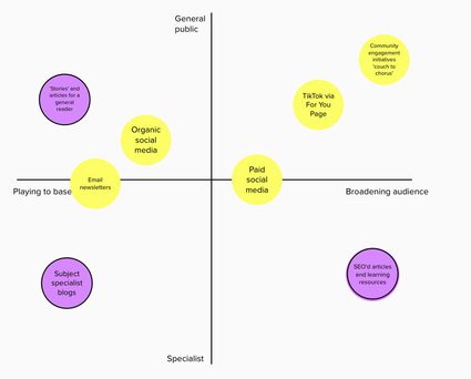
It’s a really useful tool to help you to pitch your copy most appropriately – therefore effectively.
You can read more about how to use the matrix in the issue of the Cultural Content newsletter about 'articles, editorial, and blogs'. (Sign-up to the Cultural Content newsletter, it’s one of the best in the sector and full of useful insights!)
Top tips
To finish, here are my top tips for keeping the language on your website accessible:
• Start with the bottom-line – provide additional info but don’t lead with it
• Keep paragraphs short and break them up with sub-headings – this helps people to scan-read
• Use images sparingly – they can be a distraction
• Keep it simple – using Hemingway, aim for a reading age of 9 for most web copy
• Know your audience – Louise’s matrix will help you decide when to use more specialist language
Resource round-up
And a couple of extras not mentioned in the article:
Blog post starter kit – a template to help get your colleagues from across the organisation involved with content creation
Practical SEO tips – specifically written for arts, cultural, and heritage organisations in mind
Quiz answers:
- 5% – which is just over 1.7million people (Skills for Life survey 2011 – PDF)
- 50% (BBC article)
- About 60 seconds (Nielsen Norman Group research findings)
Next, in the final post of this series, I'll be talking about how to add personality to your copy by being playful with tone of voice. Fun!