Words to the wise – website navigation

This post is all about finding the right words for your website navigation.
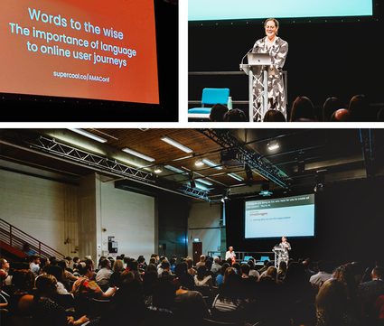
It's the first in a series of posts, based on a talk I gave at AMA Conference 2023 about the importance of language to online user journeys.
Why is language important?
To get you in the mood for thinking about how the language used in website navigation impacts user journeys, here's a quick quiz.
What kinds of content do you think would sit behind the following links in a website's menu:
- Husa
- Stage65
- Z-Pod
- Turtle Song
- Your Turn
If you guessed all 5 correctly, well done! Chances are though, you didn't get them all right. And that’s with
all your experience and knowledge of the arts and cultural sector.
Now imagine how hard that same quiz would be for website visitors – who likely don’t have a background in arts and culture, and don’t understand organisation-specific terminology.
The language you use to talk about your organisation is crucial. It
can be the difference between a user finding what they’re looking for
without really having to think about it, and them getting confused – at best – but possibly even feeling annoyed and frustrated.
Happily, improving the clarity of language on a website is often something you can
easily change. One of the biggest challenges, however, is unlearning
what you know.
Working in an organisation, you learn all the
internal jargon, and use it every day. You sub-consciously understand what things mean and so know what to expect from them. Experience working in the sector gives us a level of understanding that the general public just do not have.
But this means it can be quite easy to confuse your website visitors!
For example: In some recent website user testing I was surprised that, when presented with 'Support' in a website's main navigation, users thought it would lead to ways that the organisation could support them, rather the other way around. A quick and easy change from 'Support' to 'Support Us' made all the difference. Now, potential donors can more easily find what they're looking for, plus it's clearer to everyone that the organisation is a charity. Win, win!
Types of website navigation
The most obvious way that users will navigate around your website is through links in your main menu. This is often a series of links at the top of the page – perhaps including things like 'What's On' and 'Your Visit'. It could also be a burger menu – those three little horizontal lines which, when selected, opens to reveal a previously-hidden list of menu items.
Other ways that users move around your website include: drop-down menus, block links, buttons, and call-to-action boxes.
Whatever the type of navigation, ultimately it will include some language that the user will need to understand – and then select – in order for them to move around your website.
Challenges
Ahead of our AMA Conference session, I ran a series of roundtables with people from across the cultural sector. When discussing language in terms of website navigation, the main challenges included:
- Knowing where to start
"It can feel overwhelming, especially if you want to tackle the whole site structure."
- Managing stakeholders
"Lots of people across the organisation can be invested in the site navigation. Moving items, or getting rid of them, can be difficult to manage."
- Emotional attachments
"There can be a strong emotional attachment to internal brand and project names. Getting people to let go of these and change menu items to more conventional language is difficult."
Ideas and solutions
Roundtable participants had some great advice for tackling these challenges, including:
Look at the language on similar websites
Don’t be afraid of convention. We’re a creative sector and we like to challenge and try new things – but website navigation isn’t the best place for this creativity. It’s okay to be ordinary here – because ordinary means highly usable!
Dig into your analytics
Which are your most visited pages? If you can, check what search terms people used to find these pages. Understanding what people are most interested in can help inform what gets the most prominence in your website's navigation – and what it should be named.
If you have time to invest, here are some practical ways you can review your website navigation and structure, and make improvements:
? User journey mapping
User journey mapping is a great way to put yourself in your users’ shoes, and think like them. You’ll need to set aside some time and get input from various teams, but it can really transform how you think about your website, help to get buy-in and instill change across the organisation.
What you’ll need:
- User Persona template [PDF]
- A User Journey mapping tool – we like the RACE framework
- A facilitator
- Clear goals
- Someone who can make decisions!
Start by defining personas for 4-7 of your key users. These will likely be people who you’re trying to engage with in some way – such as a ticket booker, potential donor, commercial hirer, or someone looking for a job.
Once you have your personas, for each one, fill in the RACE framework.
This is a really useful tool that encourages you to think about how you reach those individuals, what they need, and what a conversion looks like. You might find that very little of their user journey takes place on the website, and that you need to invest in other digital marketing activities to help them get to your website, rather than relying on the website itself.
At each point in the process, try to think about the user, not your internal departments. Think about the decisions they’re making, the language they’ll use and what they need from the website.
You can do this exercise in a workshop setting, or ask individual teams to work on it in small workshops. It’s best to have a facilitator in each session. The facilitator’s role is to keep things on track, question assumptions and advocate for the user.
? Card sorting
This is one of my favourite UX (User Experience) research tools, and one you can do with your team. You get a lot of insight and decision-making for a relatively small investment of your time.
Here’s a quick guide, but if you want to know more, this website has lots of useful insights and tools. What you’ll need:
- A big room for a workshop
- About 2-3 hours of time
- Lots of Post-its (or alternative brand, or a digital equivalent!)
- A facilitator
Once you’re all gathered in your workshop, start by writing down all of the pages on your website on individual Post-its. You don’t have to list every example of every type of page. For example, “event page” is enough, you don’t need to list every event. As you write these, just add them to a pile on the table/wall.
Once you have all of these on individual Post-its, sort them into groups of similar types. For example: you might think ‘support us’ is similar to ‘legacy giving’ and ‘memberships’.
In this bit of the workshop the facilitator should watch and look out for disagreements, or things that feel difficult. It’s okay to give the participants space to debate and work things out, but you might also want to encourage quieter people to speak up. It's important to give everyone the time and space to think, debate, and challenge assumptions.
Once you have your groups, now give each one a name. The name needs to be clear, accurately describe the group, and should be jut one or two words.
Now you have your website structure – a number of sections with sensible names!
If you’ve landed on lots of groups (more than 6) you need to narrow these down. As a group, rank them from most useful for your users to least useful. You now have a priority order so you can start to think about what goes in the top level navigation, and what doesn’t.
You can also do card sorting with website users – there are some great online tools that support this.
? User testing
User testing is incredibly insightful and is one of the best ways to test your theories and ideas. However, it can be time-consuming. What you’ll need:
- 5-8 participants
- Budget to compensate the participants (usually £20+ per particiant)
- A set of user goals to test
- Participant information sheets, that outline what will happen during the testing
- An observer who watches the users as they (try to) complete tasks
This is one of the more time-consuming activities, but possibly the most useful. Once you have your participants and you’ve agreed on a set of tasks, you need to run sessions where an observer watches the users complete those tasks.
The observer's role is to look for points where the participant gets stuck or takes a wrong turn. They should encourage participants to communicate as they go, explaining their decision process. Ideally, your observer will be experienced in qualitative analysis and able to record observations and actions during the session while also putting the participant at ease. (Keep in mind that if your website isn’t well structured or the language is confusing, your participants can get frustrated and upset.)
If you’d like to run user testing, we've put together this handy User Testing Guide [PDF]
Getting the language right in website navigation – my top tips
The tools and ideas mentioned in this article are great for getting to the heart of what your users need, how they behave, and how you can create a website around them.
But you need to remain flexible and open-minded – and use your common sense. With that in mind, here are some general guidelines:
- Keep it short and simple
- Don’t overcrowd navigation
- Stick to convention
- Never use in-house project names as navigation!
And finally …
If you’re working on a new website project, make sure the content management system (CMS) will give you the control and flexibility to change website navigation language yourself. You don’t want to be paying for costly development updates just to experiment with some different words!
Quiz answers:
- Husa – an artist development programme
- Stage65 – a youth theatre
- Z-Pod – a podcast
- Turtle Song – a community engagement project in care homes
- Your Turn – opportunities to take part in activities at the venue
Next in this series, I'll be talking about accessible website copy and content structure.