Designing a high-impact, highly accessible website for Paraorchestra

When we started working with Paraorchestra we knew that accessibility was a huge priority. It’s one of the reasons we were so excited to work with them on their new website.
Paraorchestra’s ensemble of disabled and non-disabled professional musicians blends artforms, genres, and technology. They create large-scale music projects that challenge ideas of what an orchestra can – and should – be.
Before we started work on the website, Paraorchestra had developed a new brand and visual identity with the talented team at Spy Studio.
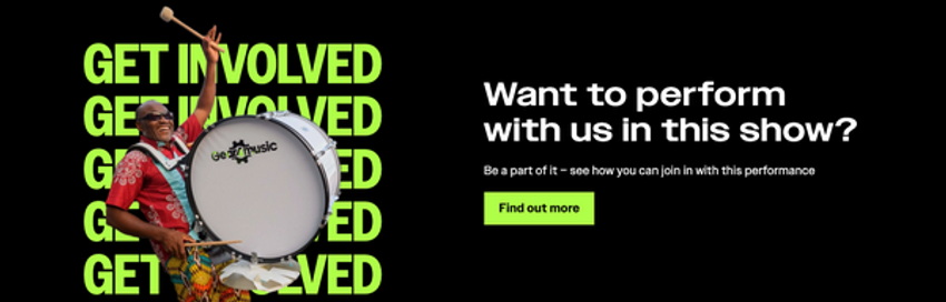
The new identity includes a rich colour palette, led by a neon green. And the typography is clear, bold and distinctive. Our job was to translate this identity into a web design that communicates Paraorchestra’s unique personality, whilst remaining highly accessible.
Visual identity review
Typography
We paid particular attention to the use of uppercase within the visual identity guidelines. We wanted to ensure legibility across the website whilst maintaining the distinctive look. More on this later!
Colour palette
We audited the colour palette to check contrast ratios – an important element of ensuring accessibility. To meet WGAC AA 2.2 Success Criterion 1.4.3 requires a colour contrast ratio of at least 4.5:1. (You can test colour contrasts on Who Can Use.)
As expected, not all colours within the Paraorchestra palette pass contrast checks against both black and white backgrounds.
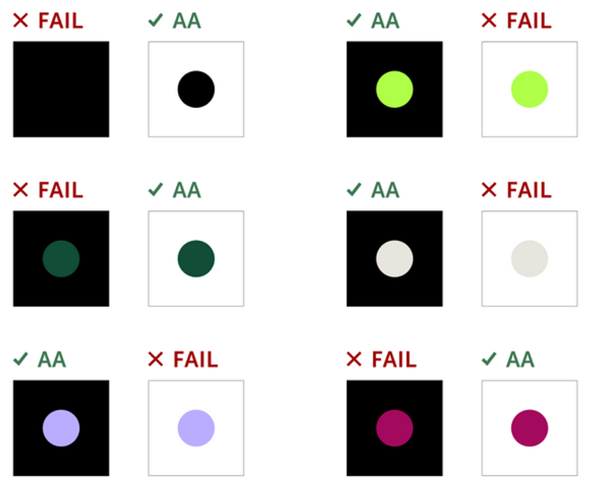
We can still use all colours from the palette on the website – but there are limitations on how we use colour and typography in combination.
The whole colour palette is used across the website but, to ensure accessibility, any text that uses a brand colour must pass minimum contrast checks for the specified font size.
This ensures a coherent visual identity, without compromising on accessibility.
The new visual identity in action
An accessible homepage with visual impact
Spy's visuals gave us some direction for the homepage design. However, in these visuals, text was positioned over imagery – always a challenge to make accessible.
It's especially challenging when the website's main menu sits over an image. Because, without sufficient contrast between text and image, the website's primary navigation won’t be accessible to some users.
During the Design phase of the new website, we trialled various iterations of the homepage to prototype alternative solutions. But they all lacked the impact and brand essence we were striving for.
So, despite being unsure exactly how we’d make it accessible, we created a homepage design that positioned text over an image.
This may seem a radical decision for a website with accessibility at its heart!
But we have enough experience in accessible design to understand the main challenges with this – making it much easier for us to tackle them successfully:
- A workable showcase image: When creating a homepage design in Figma, it’s easy to cherry-pick just the right image, and crop it perfectly. In reality, that image could be changed. And will need to work in all manner of different crops, on different screen sizes, and across different devices.
- An accessible main menu: Despite the organisational importance of impactful brand messaging, for website users, the main menu is much more important. Ensuring adequate contrast between an image and main menu text is difficult.
- Flexibility: We could have taken the approach of 'hard-coding' every pixel on the homepage. This way, we could be certain that any crop, on any screen size, would keep the main menu accessible. But that would also mean the image and text would be uneditable by the Paraorchestra team. So, if they ever wanted to update that image or headline copy, they’d have to come back to us. We know that budgets are limited, so providing Paraorchestra with as much flexibility as possible was a priority.
Our plan was to run with this design, then tweak it once we had real content to work with. So, we set aside some Design time for making changes once the website was being populated with real content. This is a highly practical approach as it prevented the project from stalling at a single – if important – decision.
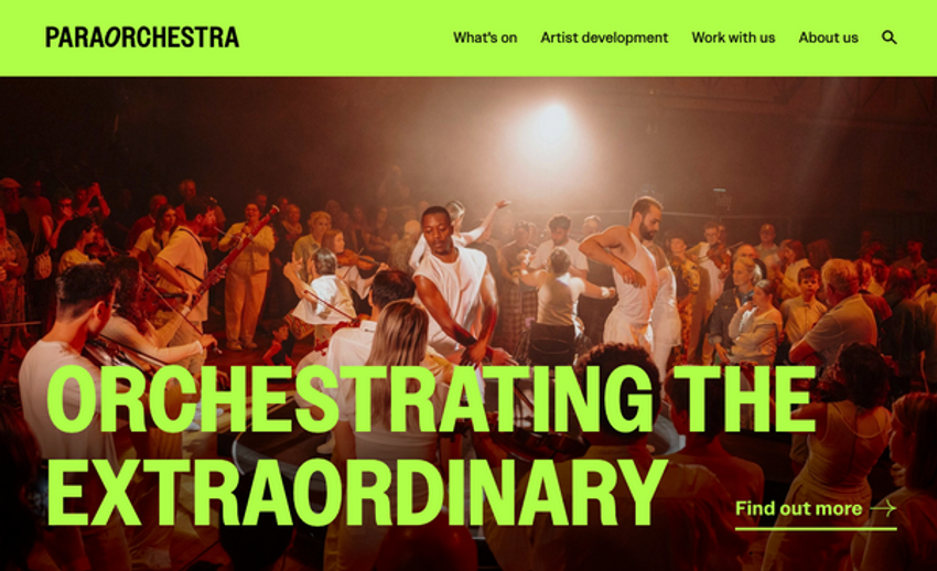
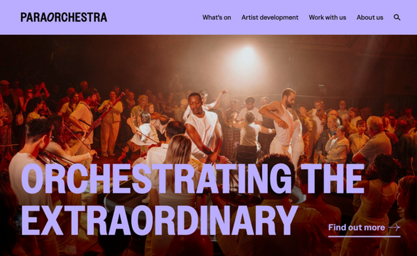
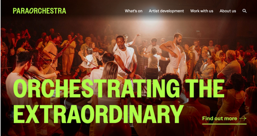
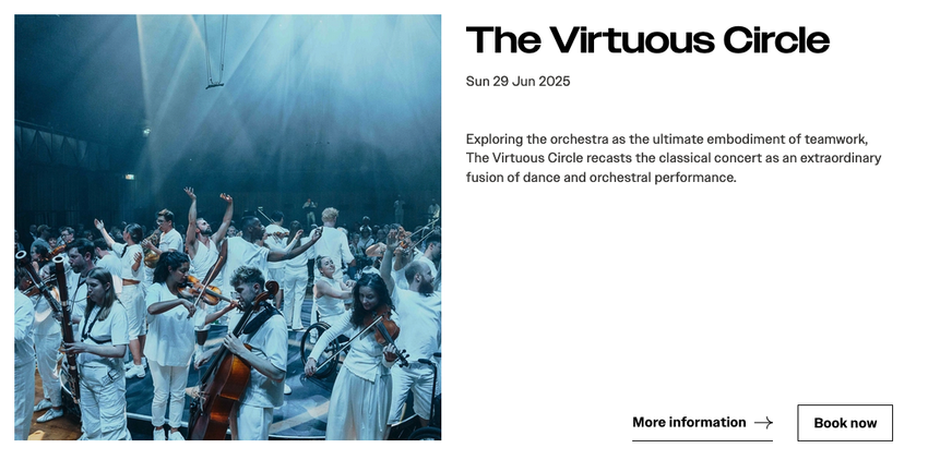
The result is a straightforward, elegant solution that allows the Paraorchestra team to choose from different overlay options to suit different showcase images. These overlays can be either a gradient, or a solid (and accessible) brand colour. So, no matter the image – within reason! – it can be made accessible.
Uppercase text
Although Paraorchestra's visual identity incorporates uppercase typography, we decided to avoid it as much as possible on the website.
There’s a strong case (!) for avoiding the use of uppercase in written content. Although WCAG 2.2 doesn’t explicitly state this, their guidance on Reading Level (3.1.5) and Pronunciation (3.1.6) – along with other readability guidance – suggests it's best avoided.
That's because when people read, they rely on split-second interpretation of distinctive letter shapes. BUT WHEN TEXT IS ALL UPPERCASE THOSE SHAPES BECOME MUCH MORE UNIFORM. Meaning it's much harder – and slower – for us to read.
To maintain a consistent visual identity without using uppercase, we chose to use the impactful display font (called Owners Wide) for headings. Using this at a considerably larger size than other text on the page gives us that boldness and contrast in hierarchy that we're looking for, without needing to use uppercase.
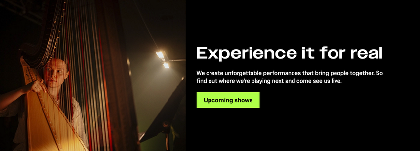
But what about the homepage? Spy's brand visuals use uppercase to great effect for the line, "Orchestrating the extraordinary".
We experimented with alternatives to uppercase here, but nothing matched it for gutsy, confident, uncompromising impact. So, we have used uppercase for those 3 words – but have done so with careful consideration of the user. This also plays well with the wider brand guidelines, as only a maximum of 5 words are ever fully uppercase.
Although brand messaging is important, it's not technically 'vital information' for users. Having those three words in uppercase won't stop anyone from fully engaging with the website. This is the only place you'll find all uppercase text across the entire website.
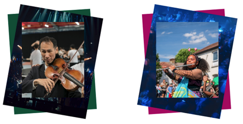
Image treatments
A distinctive layered image treatment in Paraorchestra's visual identity guidelines creates texture and visual impact. It's a quick way of reinforcing the Paraorchestra identity in a highly visual way. (Of course, ensuring that images on the website include alt text!)
Keeping accessibility in mind, we also explored laying images over text. Whilst this does obstruct the text, as long as it's used in a purely decorative (as opposed to functional) way, it doesn’t negatively impact accessibility.
A high-impact, highly accessible website
During the Development stage, Caspian from Accessible by Design did an accessibility audit to highlight any areas of improvement at an early stage. Then, once the site was built and populated, Miriam ran user testing sessions – with members of Paraorchestra – to ensure that our design choices had paid off in terms of accessibility.
This project demonstrates that a website can be both highly accessible and high-impact in terms of visual design. And it's a great example of the power of collaboration – thanks to Spy, Accessible by Design, and of course Paraorchestra!
Supercool created a website that puts accessibility and inclusivity front and centre, for a compelling showcase of our work – tested and endorsed by members of our ensemble.
Paraorchestra
Planning a new website, with a focus on accessibility? Get in touch – kate@supercooldesign.co.uk